Where do most customers choose to look for some information about a strange brand? Not Facebook or LinkedIn profile. It’s your website that always comes to their mind first. Even for a comparison between different brands in the same field, a website is also the most important element that can tell how well-organized is your digital strategy.
It not only showcases key highlights about your products, your team, and your business story but also gives your potential clients the chance to have a quick look and get impressed by what your business has been doing. Then ultimately, come up with a decision to contact you (or not), based on how well your website performed.

The 6 Signs That You Should Know to Audit Your Website
The website is like the front side of your entire house, customers place their trust in it. But sadly not everyone knows how to take good care of it. In this article, I shed light on the 7 signs that point out that your website really needs a professional overhaul.
1. It’s not user-friendly on your Website
88% of visitors are not likely to return to a site after a bad experience and it’s easy to understand why. In this industry 4.0 age, your prospects are sure to have seen dozens of websites with intuitive navigations, fast load speed, and sleek design.

How can those businesses come up with such cool websites? The answer is they know who are they trying to communicate with. You don’t have to welcome ‘everyone’, define your end-users. If you bring ‘everything’ on the screen with the hope to attract more customers, you’re so wrong, because it’s too overwhelming for visitors to water down your core offering. On the other hand, surfing your website for too long makes them feel their time is wasted, that’s a poor first impression.
2. It looks old-fashioned
If your website hasn’t been redesigned for years, you are probably lagging behind in design trends. An updated and modern design isn’t just for show, it is one of the key factors driving customers to purchase decisions.
Just imagine you’re standing in front of 2 stores selling the same product at the same price. Store A has the lights on and the door open with some twinkle decorations, a clean floor, and neatly stacked shelves. Store B has a dim light on and the door is shut, quite a dirty floor, and untidy shelves. The question is, which one do we feel more comfortable buying from?
If your answer is Store B then okay, we’re done here. Apply this rule to the online experience too. From hand-made illustrations to dynamic moving animations, business websites need to be minimalist-looking but fresh and impressive. Always remember that clients tend to make emotional decisions so it’s crucial to be visually appealing.
3. Low Responsiveness (not mobile-friendly)
As I said in my previous article, mobile phones and tablets are being used for web browsing more frequently than desktops.
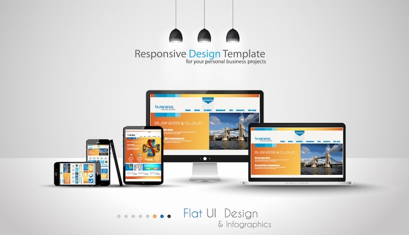
Responsive sites are completely able to change layout based on browser window size, regardless of devices. There’s nothing more annoying than exploring a site where you need to use your fingers to constantly zoom out and in just to see clearly the words and then accidentally click on the wrong link.
Making mobile and tablet-friendly websites can help to capture and convert a huge amount of traffic to frequent visitors.
4. It does not reflect your brand
Your business is growing through the roadmap, and so is your website. The changes should happen together and correspondingly. After periods of improving services and retargeting market segmentation, where you’re standing now must be apparent on your current website.
Your website has the ability to elevate your brand to a whole new level if it:
- Emphasized your brand’s core values
- Clearly showcases your works
- Appears in the distinctive colors of your brand
2018 online wanderers are savvy. We’ve been using the internet for about 20 years and surely we’re all getting tougher over time. And you, businesses, have to make great efforts to stand apart from the rest. So here’s what I – an intelligent buyer would suggest: your website represents your very own business, make it worth it.
5. It Has Poor Conversions
Mostly, the aim of a business website is to help generate leads, inquiries, or direct sales.
If your marketing activities are still set up regularly but the online sales or leads just keep decreasing, it could be a sign that your website is not connected with your audience. However, a redesign shouldn’t happen until you find out the reasons for that status. This is likely because of your CTA (calls to action) setup or in fact the site is not structured to maximize conversions.
A simple way to do the analytics for your site is using Google Analytics, for example, you can alter the CTA, and measure the response (A/B testing).
Moreover, it also offers some extremely helpful insights for studying the market.
6. Not fixed with your present marketing strategy
At the dawn of your business, your marketing strategy might be aimed to get as many inquiries as possible through an onsite contact form. And now maybe you turn into building authority by blogging and email subscriptions. It’s totally okay to change the plan, as long as your website is geared up for it.
Whether you apply a content management system (CMS) or calls to action (CTA) form for your website, a lack of key features will hold back your marketing efforts. Try to avoid bolting on a plugin here or there without optimizing and calculating, it just makes your site look untidy and still doesn’t bring an effective approach.
Conclusion
Having a modern and intuitive website is one of the most important keys for businesses to win a great number of online prospects. At Designveloper, we offer solutions for clients to rebuild and enhance their web presence and refresh and update their current websites to the most modern version that not only well reflects their brand but also brings real business results. Contact us and we can begin your digital refresh right away!
Truc Thuy Minh


Read more topics


