Email marketing is the cornerstone of any successful digital marketing strategy. Not only is it cost-effective, but its tracking capabilities provide valuable insights that can help you refine your messaging and reach broader audiences over time. However, in today’s world of constant connectivity, it’s not enough to simply send out emails to a list of subscribers. With more and more people accessing their email on mobile devices, it’s crucial for businesses to ensure that their emails are optimized for mobile viewing. This is where mobile-responsive design comes in.

What is Mobile-Responsive Design?
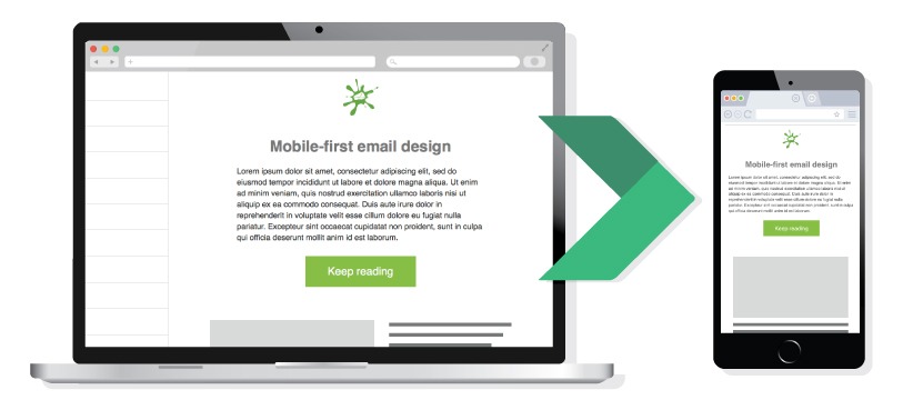
Mobile-responsive design is the practice of designing and coding email templates that automatically adjust to the size and shape of the device on which they are being viewed. This means that whether someone is viewing an email on a desktop computer, a tablet, or a smartphone, the email will be easy to read and navigate.
The Importance of Mobile-Responsive Design in Email Marketing
According to a recent HubSpot study, the majority of email views (41%) occur on mobile devices. This means that if your emails are not optimized for mobile, you could be missing out on a huge chunk of your potential audience. Not to mention, people are more likely to delete emails that are difficult to read or navigate on their devices, which can negatively impact your open rates.

By optimizing your emails for mobile devices, you can ensure that all of your subscribers are able to get the most out of every message, no matter what device they’re using. This will not only help improve engagement and increase conversions but also build credibility with customers and prospects alike.
In addition, mobile-responsive design is becoming increasingly important for SEO purposes. Google now penalizes websites that are not optimized for mobile, so ensuring your email templates are mobile-friendly is yet another way to keep Google happy — and boost your rankings in the process.
FURTHER READING: |
1. |
|
|
How to Make Your Emails Mobile-Responsive
Making your emails mobile-responsive can seem like a daunting task, but there are a few things you can do to ensure that your emails are optimized for mobile viewing.

1. Use Mobile-Responsive Templates
One of the simplest ways to make your emails mobile-responsive is to use a mobile-responsive email template provided by various email marketing service providers. These templates are typically built with mobile responsiveness in mind, so you don’t have to worry about doing any additional coding.
2. Use Single-Column Layout
Another thing you can do to make your emails mobile-responsive is to use a single-column layout. This means that all of the content in the email is arranged in a single vertical column, as opposed to being spread out across multiple columns. A single-column layout is easier to read on a small screen and makes it easier for users to navigate through the email.
3. Optimize Images and Media
Make sure that any images or media included in the email are optimized for mobile. This involves ensuring images are sized correctly and compressed so they don’t take too long to load, and using HTML5-friendly media formats such as MP4 for videos.
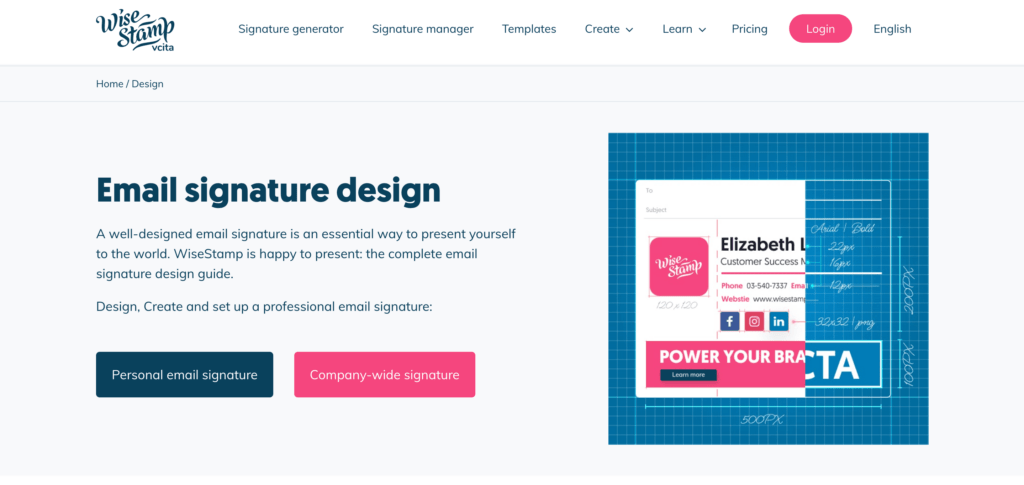
In addition, it’s also important to have a mobile-responsive email signature design. All of the information you include, such as your contact information and social media links, should be easily viewable on mobile devices, as this can help boost your visibility and drive more leads.
Recommended reading: 8 Responsive Web Design Principles You Need to Know
4. Use Large, Touch-Friendly Buttons
One of the most important elements of mobile-responsive design is the use of large, touch-friendly buttons. The buttons in your email should be large enough to be easily tapped on a small screen and should be spaced apart to prevent users from accidentally tapping the wrong button.
Additionally, make sure that the buttons are clearly labeled and stand out from the rest of the email design. This will make it easy for users to quickly identify and tap on the buttons they want to interact with, such as a “Buy Now” or “Sign Up” button.
5. Use Conditional Content
Another effective way to make your emails mobile-responsive is to use conditional content. This means that different elements of the email are displayed depending on the device it is being viewed on.
For example, you can use a different template for desktop and mobile versions of the email, or you can hide certain elements, such as images or sections of text, on mobile devices. By doing this, you can ensure that the email looks and works great on any device, without overwhelming the user with too much content.
6. Test and Monitor
Lastly, it is important to test your email campaigns on different devices and monitor their performance. Email marketing service providers offer tools such as email previews and testing functionalities, which allow you to check the email on different devices before sending it out to your audience. This will help you identify any issues with the mobile-responsive design and make any necessary adjustments before sending the email to your entire list.
Final thoughts
In today’s world, mobile-responsive design is an essential aspect of any email marketing campaign. With almost half of all email opens occurring on mobile devices, it’s important to ensure that your emails are optimized for mobile viewing.
Not only will this help you to reach a larger audience, but it will also lead to better engagement rates and ultimately better conversion rates. So if you want to get the most out of your email marketing campaigns, be sure to implement mobile-responsive design principles and regularly test and monitor your email’s performance on different devices.


Read more topics


