Every field has its own specialized language or jargon and the field of UI/UX design is no exception. Whether you’re a newbie looking for a design job or a customer trying to communicate with a design agency by designer language, understanding UI/UX design terms is a necessity.
To help you eliminate frustration when getting involved in the design industry, we’re here to make things easier. In today’s article, we’ve compiled some of the most common terms you should know when learning about UI/UX design.
Is There Any Difference Between UI and UX Design Terms?
Before diving into our top 30 terminologies today, let’s make clear what’s different between UX and UI terms:
- UX Terms (User Experience): UX focuses on how users interact with a computer or device. This broad term includes several disciplines that study the effect of design on the ease of use and level of satisfaction with a product, site, or system. Some UX terms you may commonly see include “Usability,” “User Persona,” and “A/B Testing.”
- UI Terms (User Interface): This broad concept, on the other hand, focuses on the technical use of a product or service and its essential physical interface. In other words, it covers terminologies that describe how the product looks, like “Color Palette,” “White Space,” or “Typography.”
30 Main UI UX Design Terms That You Should Focus On
In this section, we’ll elaborate on 30 essential UI/UX design terms you should consider:
Recommended reading: 45 Web Design Terms: The Basic Glossary
1. A/B Testing
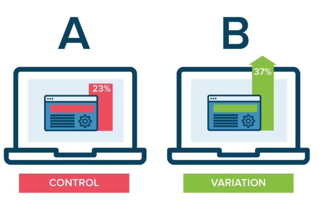
This is a method comparing two versions of a product (i.e., an app design, webpage, or button) used between a group of users. Its primary goal is to determine which one performs better or which one is more interesting to users. For instance, you A/B test two versions of a button: “Buy Now” and “Shop Now.”
FURTHER READING: |
1. Top 10 Best UX UI Design Companies |
2. Top 7 Essential UI Design Principles for Newbies |
3. The 6 Factors to Choose a UI UX Design Company |
2. Accessibility
Accessibility refers to designing a product (like apps, websites, or software) that everyone, including people with disabilities, can use. In other words, this involves creating user interfaces that meet a variety of needs, such as allowing for voice recognition or assistive technologies (e.g., screen readers).
3. Affordance
Affordance in UI/UX design is what makes something look usable. Particularly, it’s about the visual properties of an interface element that suggest how users should interact with the element. For example, a text field has a box shape, indicating you can type into it. If a certain element (like a button) has poor affordance, it makes users confused and need further instructions to use it.
4. Breadcrumb
Breadcrumb is a navigation trail that shows users where they’re staying now on your website. Below is a typical example of a breadcrumb on Penn Foster College’s website:
“Home > Programs > Computers > Computer Information Systems Associate Degree”
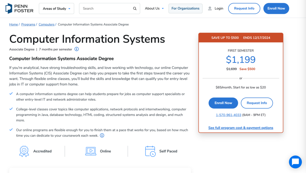
As can be seen, a breadcrumb often appears just below the main navigation menu, near the top of the webpage. By clicking on the “Computers” category, visitors can view other relevant programs rather than searching again or navigating back to the homepage.
5. Call to Action
It’s a term used for describing specific texts, images, banners, or buttons that encourage the reader or viewer of a website to take an expected, predetermined action. Some simple examples include: “Click here” or “Buy now”.
Recommended reading: UI vs UX Design: Definition and Why This Comparison Should Not Exist?
6. Card Sorting
Card sorting is a research technique that helps you identify how users organize and classify information. This is helpful for building intuitive navigation menus or website structures.
In a card sorting session, you first write down different features or content on separate cards which can be digital or physical. You then give these cards to users and ask them to organize them in a way that makes sense to them. Based on patterns in how users group the cards, you can determine logical labels and design an information architecture that aligns with user expectations.
7. Cognitive Load
Cognitive load is the amount of mental effort a user needs to interpret and interact with a specific product (e.g., an app or a website). High cognitive load indicates that users are frustrated and overwhelmed. This can result in making mistakes or abandoning the product. To reduce cognitive load, you need to make user interfaces more intuitive by reducing options, using familiar patterns, and keeping content concise.
8. Conversion
This term is used to describe when visitors take whatever action that you want them to take such as: completing a web form, submitting a request for information, subscribing to a newsletter, or making an eCommerce purchase.
9. Design System
A design system is a reusable set of UI components, code standards, and design guidelines that help your team create consistent products.
10. End User
End users are the ultimate target audience who interact with and use your product. Any product designed – whether it be a website, an app, or software – aims to meet the needs and preferences of these users. Therefore, understanding end users guides your entire design process effectively.
11. Fidelity
This UI/UX design term implies how similar your design or prototype is to the actual, finished product in terms of appearance, features, and interactivity. When learning about UI/UX design, you may hear of these terms like “low-fidelity,” “mid-fidelity,” and “high-fidelity.”
Low-fidelity refers to basic wireframes that focus on structure or layout without much detail. Mid-fidelity, meanwhile, are digital wireframes that have more structure yet limited style. High-fidelity are detailed prototypes that have realistic colors, images, typography, and full interactivity. So, they most closely resemble your final product.
12. Flat Design
This is a design philosophy that focuses on clean and minimalist styles. Quite literally, flat means design that has no dimensional depth. Instead of designing elements that look like you can reach out and grab them, the flat design goes back to the basics of graphics – bright colors, primitive shapes, icons, etc.
Recommended reading: 5 Best Benefits of Responsive Web Design for Your Business
13. Heat Map
This is a visual representation of user behavior on an app or a website. It tracks which parts of your webpage users click the most or how far down they scroll on the page. Accordingly, a heat map uses color coding to display activity levels. In particular, “hot” colors like red and orange reveal high activity while “cold” ones like blue or green indicate low activity.
14. Information Architecture
It refers to the organization of the information, dealing with what pages go where in a website’s structure, what content is contained on each page, and how each of these interacts with other pages within the site
15. Landing page
In the purest sense, a landing page is any web page that a visitor can arrive at or “land” on. Oftentimes, a special landing page is designed for a specific business purpose (usually in connection with an advertising or marketing campaign)
16. Material Design
This UI/UX term refers to a design system developed by Google. It offers a standardized set of components and standards, which helps you create and manage a more detailed design system. This ensures consistency across visual elements for design projects and improves user experience. Below is how Designveloper uses Google Material 3 to standardize our color choice.
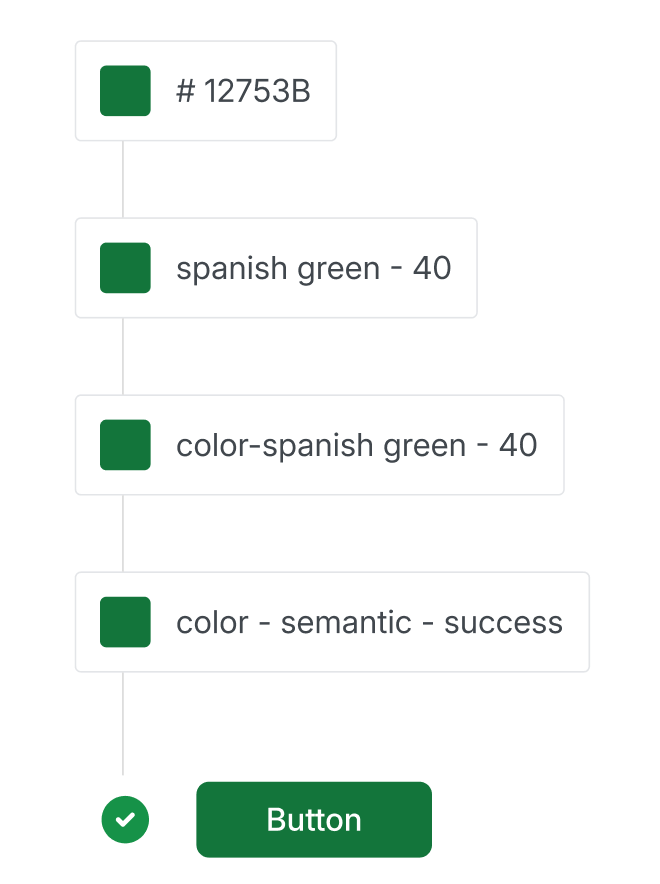
Each color has a specific name, function, contrast level, and usage guidelines. With Google Material 3, we establish clear rules for designers to follow, ensuring consistent and proper color use.
17. Micro-interaction
Let’s look at this example: When you see the red and white box icon on Facebook, you automatically know that you have a new message and immediately click on it to read it. That’s micro-interactions.
Micro-interactions make devices more human-like in their moments. As a result, the design is more usable and enjoyable.
18. Mock-up
Mockups are basically real-size models of how your design is planned to look.
19. MVP (Minimum Viable Product)
In UI and UX design, this term refers to the simplest version of an app or a website. It only includes the core functionalities needed to address certain problems. In other words, it’s functional enough to attract early users, collect feedback, and test the feasibility of your product idea.
20. Navigation
Navigation indicates how users move through the interface of a website or an app to complete specific tasks (e.g., looking for information). In UI/UX design, this term refers to designing and organizing components like menus, buttons, or search bars to guide users through the digital product.
21. Onboarding
This UI/UX design term is all about accustoming users to a new website/app or functionality. It’s often considered the first interaction of users with the product, aiming at leaving a positive first impression and encouraging long-term engagement. One typical example of onboarding is tooltips appearing when users hover over a button for the first time.
22. Personas
A persona is a profile of your ideal customer. It is usually a fictional character created based on your user research and interview data.
23. Pixel
You may often hear some phrases like this, “Each icon has a default size of 24×24 px.” So what is “px”? Px, or pixel, is the smallest measurement unit for digital images and displays. Standing for “picture element,” a pixel represents a tiny square or dot that contributes to forming digital content when combined with other pixels.
24. Prototype
Many people cannot distinguish a prototype from a wireframe. Look at it this way: Wireframe is just a low-detail presentation of a product. But a prototype is a medium or it can highly detail the representation of the final product.
It’s the sample model of the product that gives the ability to test it. And see if the solutions and decisions made about the product are efficient.
25. Responsive Design
Responsive design creates a layout that magically adjusts itself to fit any size of the screen, whether desktop, mobile, or smartphone.
26. Usability
This UI/UX design term indicates how easy a website or an app is to use. Accordingly, a usable product is one that users can easily understand, navigate around, and perform tasks without confusion. So, when it comes to usability testing, we often refer to the process of testing how easily a group of users completes certain tasks on your digital product.
27. User Flow
This is a flowchart or diagram that visualizes actions a user takes to perform a certain task. It ranges from how the user begins their journey (like arriving at the homepage) to how the user completes the task (like submitting a contact form).
28. User Stories
User stories are short, simple descriptions of a specific feature from the user’s angle. In other words, instead of explaining why designers create that functionality, user stories focus on what the user wants to achieve and why. This helps develop user-centered solutions.
Normally, a user story often starts with a structure like, “As a [user type], I want to [action] so that [benefit or goal].” For example, as a frequent customer, I want to see advanced filtering options so that I can look for exactly what I want.
29. White Space
White space can also be called negative space. It’s the blank space that surrounds the text, images, or other parts of the page. One more thing to add, white space is not necessarily white but uses the background color of the site.
30. Wireframe
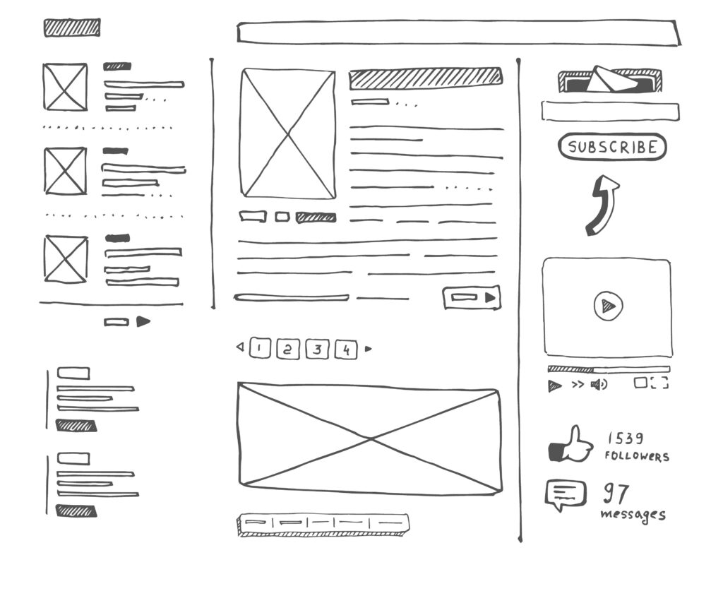
In short, a wireframe is a skeleton of your app or product. As I mentioned above, it’s a low-detailed presentation of design – no images, no content, and no interactive elements. It’s like your website blueprint. Designers will take the main group of content that you want and lay it out exactly as it will be on your product.
Conclusion
That’s a look at some of the more common UI UX design terms you’ll see in the design world. Now you’re practically a designer, right? Just kidding! But guess what? You are totally ready for your meetings with a design agency! By no means is this the be-all-end-all of web design terminology… so feel free to add your own glossary in the comments as well.


Related Articles
Read more topics


