


Designer’s Guide to Building Client Websites That Stand Out in 2025
April 23, 2025

Creating websites that inspire and engage has never been more critical than in 2025. In every business, no one misses that their website, not only meets the needs of customers efficiently, but also leaves a good impression as well. For designers, this translates to using next-gen tools, exciting techniques, and unique strategies that distance their projects from others. Some facts standing out in the saturated digital marketplace demands precision, innovation and adaptability.
Essential Guide to Build Client Websites

Among others Elementor is the best tool for designers. No other tool can beat it with its interface, real time editing and limitless customization options which helps in achieving outstanding results. In fact, with Elementor’s advanced design features for professionals, designers can bring their clients vision to life through stunning websites. Elementor makes it easier for your designers to focus on flexibility and creativity when working on dynamic layouts or interactive components. In this post, we will look at 10 solutions designers can implement to create killer client websites, and why Elementor is the best tool to do it.
1. Custom Designs Using Elementor
That’s why designers love the flexibility of Elementor to build great websites fast. Its drag-and-drop builder provides comprehensive design tools for professionals, enabling pros to experiment and refine layouts without the need for technical code.

If you want to speed up your designs, you can use Elementor’s real-time editing and expand your designs with its huge widget collection. The inherent simplicity allows designers to achieve neat results under tight deadlines.
Designs aren’t interactive and take a lot more time without tools like Elementor. Linear workflows stifle creativity and compel dependence on obsolete manual practices.
This allows the designer to open any section of a website to insert movement effects, custom shapes, or interactive animations with ease using Elementor. Thus, every detail of your design is seamless and groundbreaking.
2. Mobile-First and Responsive Designs
In 2025, mobile-first design is as significant as it was then, as more users access the internet via mobile devices. Websites need to be perfectly optimized for smaller screens.
Optimised designs speed up loading, minimise bounce rates, and retain users. These principles ensure better usability across devices.
Neglecting mobile-first approach costs you huge traffic and limits accessibility. Users frustrated with slower non responsive websites leave without converting.
To create a mobile-first experience, designers can prioritize fluid designs, expandable menus, and touch-friendly elements.
3. Accessible Designs
So it all boils down to wider reach and creating a trust between users. With clear navigation, inclusive design principles create websites everyone can enjoy. Accessible features on a website indicate a brand’s commitment to meeting the needs of users with diverse requirements. It also communicates empathy and inclusiveness.
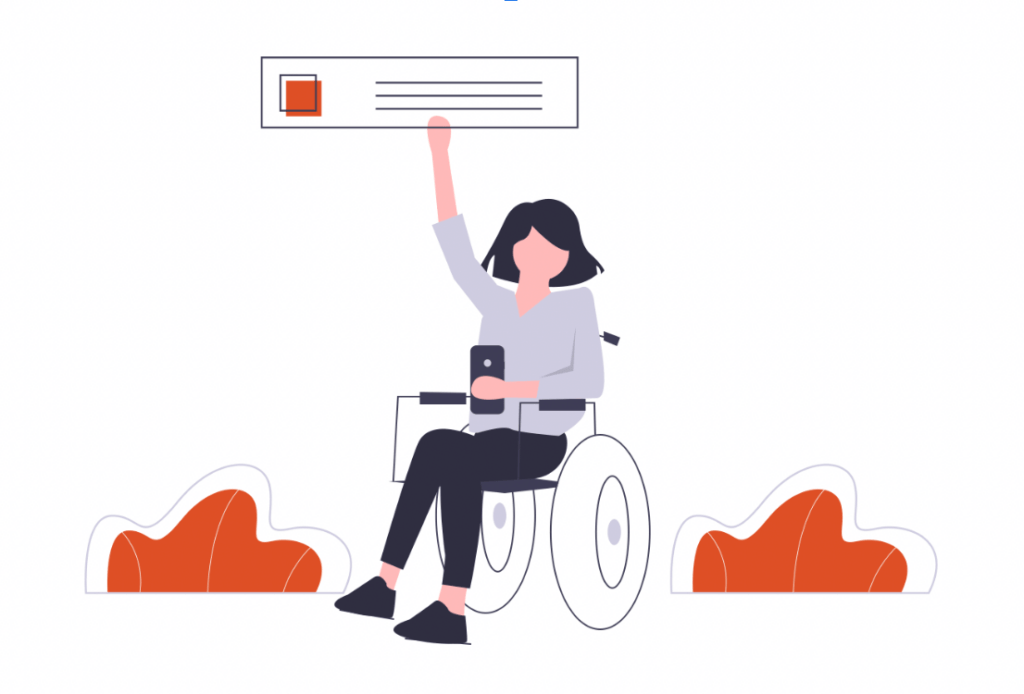
Maintaining keyboard navigation and descriptive alternative text improves the utility of the design. Audio content can be accompanied by transcripts, while video content should include closed captions. Well-structured forms with visible labels & validation features enhance user experience for everyone. Such wide accessibility measures make websites really stand out.
Most websites risk leaving a segment of their potential audience behind if they do not prioritize accessibility. Frustrated visitors tend to exit in response to usability hurdles or roadblocks. Being excluded brings loss of revenue and the risk of potential penalties, particularly as accessibility standards continue to expand. Failure to address these needs risks alienating users and eroding a site’s reputation.
Simple keyboard shortcuts is one example of how to keep content simple for users with motor impairments. For visually impaired users, an online shopping site must support features such as resizing text font and adjusting color contrast to make navigation a smooth process. These enhancements improve function as well as demonstrate consideration of clients.
4. Data models and additional assets are ready to use
Such access to a extensive asset library for distinctive websites enables designers to add unique visual layers. Icons, imagery, and templates are a way for the designs to get in line with a particular set of client requirements.
These libraries allow the user to save time and energy on collecting or creating assets. Resources are abundant, which allows for designers to concentrate on the user experience itself.
Come with scant libraries, and the designs become shallow and inconsistent. Websites are made basic and repetitive due to limited resources.
For example, a designer creating a photography portfolio may utilize prebuilt galleries and high-resolution sections from an asset library. That saves hours of manual integration.
5. Optimizing Load Times
Shady websites go away from users, and create an impression on users about a client. Users demand quick, responsive designs. Therefore, optimizing your website load time can directly affect your customers to stick around, a good experience and your search engine ranks. An average users will spend more time on an optimised site which adds value to the interaction.
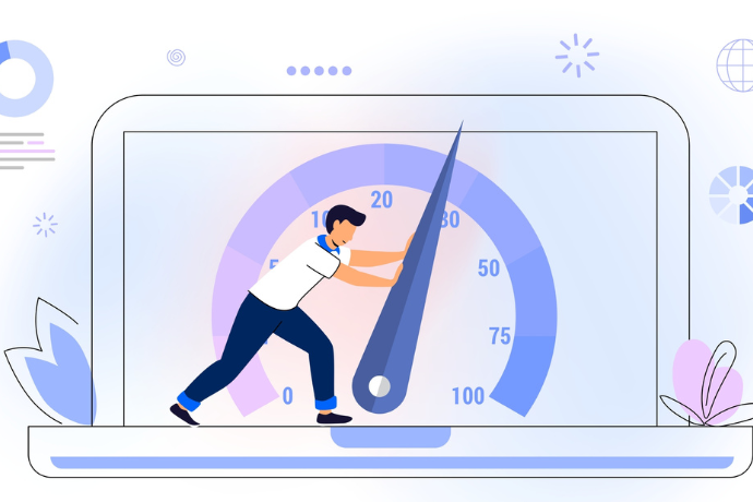
Optimizing image sizes, submitting to content compression, and employing lazy image loading help to reduce delays. Responses such as asynchronous script loading ease load on browser processes. Improper optimization of external media files can also affect the response time. The Guided Performance track uses two key principles that are helping to ensure these load efficiently and guarantee better user experiences.
A gaming blog that optimized asset delivery with browser caching significantly reduced load times. To throttle the response time on download files, server-side compression not only reduced download speeds but also capped the server utilization when simultaneous requests were made. Users had a better navigation experience which bred loyalty. Dynamic composition of pre-compressed resolutions on complex animations into webpages enhances UX and increases efficiency.
6. Utilizing Data-Driven Designs
Data-driven workflows empower designers to track their impact on audience behavior. Other tools such as click tracking and engagement heatmaps are used by designers to identify areas for improvement. These insights guide decisions that take into account user preferences and maximize efficacy. Metrics provide the grounds for more design-focused appeal grounded in user interaction.
Identifying gaps in website engagement through user demographics and session durations or browsing activity Strengthened functionality and purposeful page layouts come from iterations based on visitor feedback. With this refined approach, guesswork is merely an assumption, resulting in from the right audiences when they are at the readiness to engage with your brand, allowing for higher conversion rates and repeat interaction.
For example, heatmap tracking reveals poor engagement in buried product categories. Bringing neglected aspects into areas of visibility causes user interaction to increase. A/B testing site layouts shows which versions drive traffic. Inspection of exit data regularly embeds high-bounce landing pages.
7. Adding Micro-Interactions
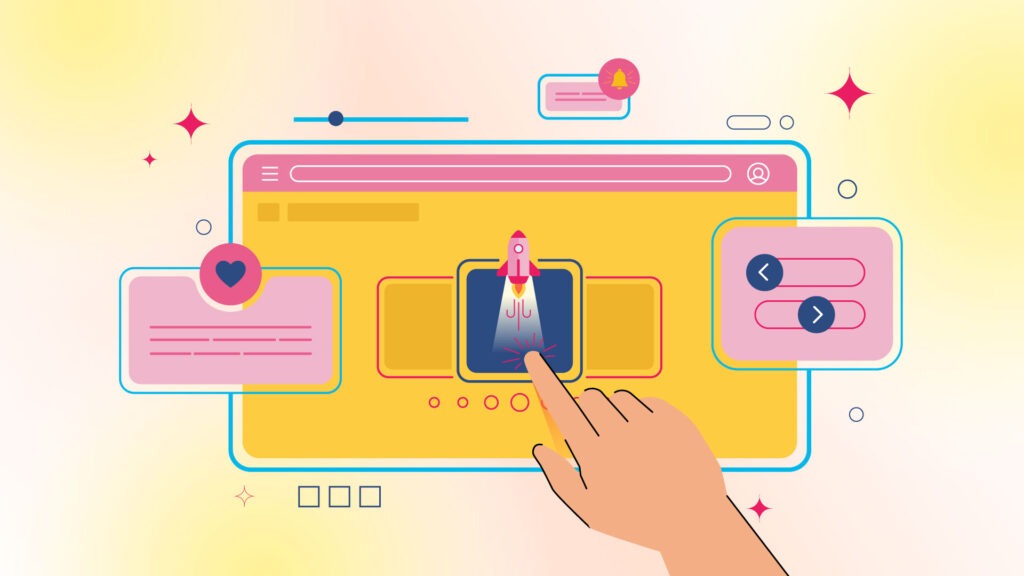
So, minimal interactive elements like hover effects, button animations etc. enhance user engagement. Fine details can also add a lot to visual appeal.
Micro-interactions inform and guide the user to the action they want to achieve. They heavily contribute to intuitive navigation.
Without those elements, websites fall into a static, boring and hard-to-engage-with site. Flat designs are less memorable for audiences.
For clickable images, designers could incorporate hover-reveal animations. It makes the transitions smoother and calls to action.
8. Long-Term Growth Solutions that Scale
Scalability helps the designers to make websites future-proof, with easy updates and expansions. A flexible platform is one that can easily adapt to increasing content or functionality.
Scalable sites can handle greater amounts of traffic, ensuring resiliency through future demands. This foresight reduces the cost of redesigning.
Non-scalable sites often end up breaking down or requiring upgrades. It can become outdated relative to other competitors very quickly.
Scalable e-commerce platforms also use a modular grid that allows for new product pages to be added without affecting layouts.
9. Clean and Minimalist UI
Web design trends are now more inclined toward simplicity and cleanliness. It shifts focus and encourages intuitive navigation, as minimalist designs value utility over clutter.

Look at any company website, white spaces, clear text types, and uniform frameworks reflect professionalism and trust. The clarity minimizes user confusion and increases interest.
Overwhelmed viewers and diluted messages are from crowded designs. Client Struggles with Exit Rates and Branding Issues
An article scrolling story website could have minimal parallax effects which would make the stories short yet visually dynamic.
10. Improved Collaboration Tools
Collaboration tools allow teams to work on designs together, pushing updates back and forth in real-time. Designing in groups ensures more creative inputs.
Stakeholders must work together in harmony to eliminate productive iterations, confusion, or rework. High performing teams deliver polished work with time to spare.
Workflows are mismatched and separated without collaborative technologies. Deadlines slide, damaging the client relationship.
Mockups are made through synced platforms when layered in such a way that edits can be made in real time with feedback. This reduced lag speeds up approval cycles.
Conclusion
WUtilizing some of such techniques which includes accessibility, micro-interactions, and so on, can guarantee that the output of such projects will be a great UX. Strategies like mobile-first design, fast load times, and data-driven decisions have become not optional but necessary for success.
Elementor is helping to reshape the standards of the web design world. With a broad asset library and an easy-to-use interface, it stands out among all-in-one software tools for professionals. No more rigid workflows, with Elementor designers can explore, improve and design with worriless. This also arms them with access to a broad asset library for unique websites, so that every project has its personal feel.
These tools and techniques will define the new generation of web design. Those who take inspiration from this benchmark will truly bring their client visions to life, not just fill a web page with data. By utilizing Elementor and these strategies, you ensure that your designs will make a huge impact, providing your clients and audiences both impressed and satisfied.
Also published on

Share post on


Read more topics


