


How to Create a Custom Dialog by Angular Material Dialog?
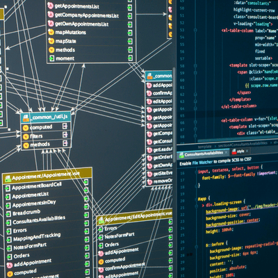
Creating custom dialogs with Angular Material Dialog is a powerful way to enhance user experience in your Angular applications. According to recent reports, the usage of Angular Material Dialog has increased in the past year, highlighting its growing popularity among developers. Understanding the custom dialog development process is the focus of this article which demonstrates creation methods while providing official source examples.
First, let’s understand what Angular Material Dialog is and why it’s beneficial. Angular Material Dialog is a service that allows developers to open modal dialogs with Material Design styling and animations. The service finds many applications within web development to authenticate users while managing forms alongside showing notifications. For more detailed information, you can refer to the official Angular Material Dialog documentation.
Throughout this section we will show you the procedure for designing your own dialog window. The first step includes importing required modules after which we set up our dialog component. We will show you how to launch the dialog followed by details on passing information to it before showing you the process of handling user actions. The steps will contain demonstration codes together with explanatory text to provide clear understanding.
By the end of this article, you’ll have a solid understanding of how to create and manage custom dialogs in your Angular projects. Whether you’re a beginner or an experienced developer, this guide will help you leverage the full potential of Angular Material Dialog.
The Importance of Knowing How to Create a Custom Dialog by Angular Material Dialog
Creating custom dialogs with Angular Material Dialog is crucial for developers aiming to enhance user experience and streamline application functionality. According to recent statistics, Angular Material is used by over 25,695 live websites, with an additional 69,004 sites having used it historically. This widespread adoption highlights the importance of mastering Angular Material Dialog for developers.
Developers use custom dialogs to build application dialog systems which improve user interfaces for better application usability. A custom dialog component enables developers to execute user action confirmation as well as information presentation and user data acquisition tasks. By leveraging Angular Material Dialog, developers can ensure consistency in design and behavior across different parts of the application.

Moreover, Angular Material Dialog offers various configuration options, such as disabling the close button or setting autofocus, which can be customized to meet specific requirements. The necessary flexibility appears in creating applications which respond dynamically to their environment.
In summary, knowing how to create a custom dialog with Angular Material Dialog is vital for developers looking to improve user experience and application functionality. The ability to create user-friendly applications through this skill leads developers to deliver applications which result in better user satisfaction and increased engagement.
A 5-Step Guide to Creating a Custom Dialog by Angular Material Dialog
Creating a custom dialog with Angular Material is a powerful way to enhance user interactions in your Angular applications. In this guide, we will walk you through a 5-step process to create a custom dialog.
Step 1: Declaring a Material Dialog Body Component
To begin creating a custom dialog in Angular, the first step is to declare a component that will serve as the dialog’s body. Before doing so, ensure that you import MatDialogModule from Angular Material in your module file.
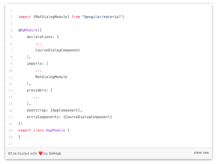
In this example, CourseDialogComponent will act as the content container for our custom dialog. To use it correctly, we must declare it as an entry component. Failing to do so may result in errors when attempting to open the dialog.
By properly setting up the dialog body component, we ensure smooth integration with Angular Material Dialog, allowing for a flexible and reusable modal structure.
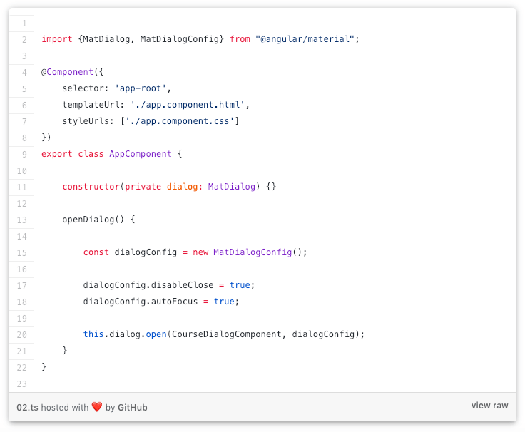
Step 2: Creating and Opening
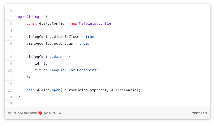
Now that we’ve declared our dialog body component, we’re ready to create and open a Material Dialog in Angular. A dialog instance needs opening from one of our components.
Understanding the Process
Let’s break down what happens when we create and open an Angular Material Dialog:
- Injecting MatDialog Service: The constructor of our component requires an injection of the MatDialog service for dialog creation. This service provides the necessary methods to manage dialogs in Angular Material.
- Configuring the Dialog with MatDialogConfig: The dialog configuration gets its default values through an instance of MatDialogConfig which we create. Multiple default settings exist which users can modify before customizing the dialog interface.
- Overriding Default Behaviors: disableClose: true – This prevents users from closing the dialog by clicking outside of it. autoFocus: true – Automatically sets the focus on the first input field inside the dialog, improving user experience for form-based dialogs.
Angular Material Dialog Configuration Options
The MatDialogConfig class allows further customization through various configuration options. In addition to the properties we’ve modified, here are some other commonly used options:
- hasBackdrop: Determines if the dialog should have a shadow backdrop, that will block the user from clicking on the rest of the UI while the dialog is opened (default is true)
- panelClass: Adds a list of custom CSS classes to the Dialog panel
- backdropClass: Adds a list of custom CSS classes to the dialog backdrop
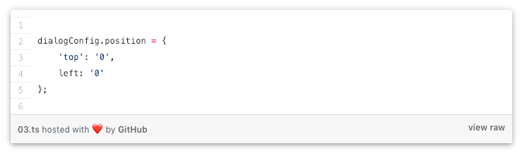
- position: Defines a starting absolute position for the dialog. For example, this would show the dialog in the top left corner of the page, instead of in the center:
- direction: Specifies text direction. The default is left-to-right (ltr), but we can also specify right-to-left (RTL).
- closeOnNavigation: This property defines if the dialog should automatically close itself when we navigate to another route in our single-page application, which defaults to true.
- Size Properties: The MatDialogConfig class comes equipped with properties to handle dialog size through width, height and minWidth, minHeight, maxWidth, and maxHeight attributes.
Step 3: Building the Material Dialog Body
Now, let’s take a closer look at CourseDialogComponent. This component serves as the body of our Angular Material Dialog, but it remains a standard Angular component—it doesn’t need to extend any special class or implement a dialog-specific interface.
The content inside this component is entirely flexible. We can structure it using plain HTML and CSS, without relying on any Angular Material directives. However, if we want our dialog to align with Material Design principles, we should use specific Angular Material directives to style and structure the content effectively.
But if we want the dialog to have the typical Material Design look and feel, we can build the template using the following directives:
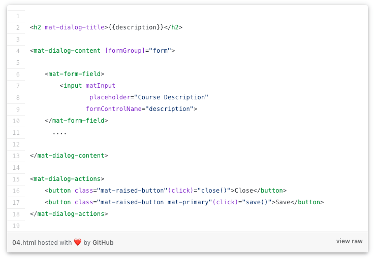
To achieve a well-structured and visually appealing Angular Material Dialog, we can use the following directives:
- mat-dialog-title: This identifies the title of the dialog, in this case, the “Angular For Beginners” title on top
- mat-dialog-content: this container will contain the body of this dialog, in this case, a reactive form
- mat-dialog-actions: this container will contain the action buttons at the bottom of the dialog
Step 4: Passing Input Data to the Material Dialog
The majority of dialog applications function to modify and enhance previously saved records. When opening the dialog we can place data into its component by using the data property of the dialog configuration object.
To send data into the dialog, we configure it in the parent component (e.g., AppComponent) like this:
Inside CourseDialogComponent, we retrieve the passed data by injecting MAT_DIALOG_DATA:
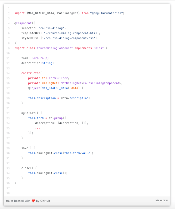
As we can see, the whole data object initially passed as part of the dialog configuration object can now be directly injected into the constructor.
We have also injected something else, a reference to the dialog instance named dialogRef. We will use it to close the dialog and pass the output data back to the parent component.
Step 5: Closing the Dialog + Passing Output Data
Now that we have an editable form inside a dialog, we need a way to pass the modified (or new) data back to the parent component. We can do this via the close() method. We can call it without any arguments if we simply want to close the dialog:
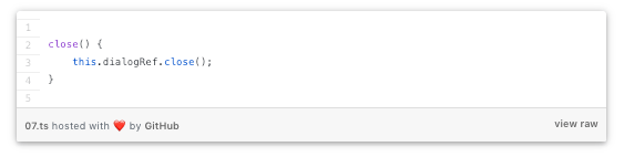
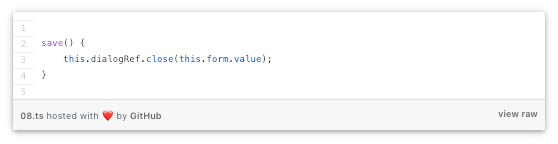
But we can also pass the modified form data back to AppComponent in the following way:
In the component that created the dialog, we can now receive the dialog data in the following way:
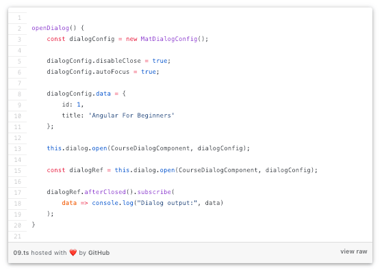
As we can see, the call to dialog.open() returns a dialog reference, which is the same object injected in the constructor of CourseDialogComponent. We can then use the dialog reference to subscribe to the afterClosed()observable, which will emit a value containing the output data passed to dialogRef.close().
Conclusion
Creating a custom dialog with Angular Material Dialog is a powerful way to enhance user experience in your applications. By leveraging Angular’s robust framework and Material Design’s sleek aesthetics, you can build intuitive and visually appealing dialogs. With Designveloper’s extensive experience in Angular development, we’ve successfully implemented numerous projects, such as the ODC healthcare platform and the Bonux crypto wallet, showcasing our expertise in creating seamless user interfaces.
The competitive tech environment demands continuous discovery of modern tendencies and suitable industry practices to survive. According to recent reports, Angular Material Dialog continues to be a preferred choice for developers due to its flexibility and ease of integration. By following the step-by-step guide provided in our comprehensive article, you can master the art of creating custom dialogs and elevate your Angular projects to the next level.
Ready to dive in? Check out our detailed guide and start building custom dialogs with Angular Material Dialog today!
Also published on

Share post on


Related Articles

15 Lifestyle Business Ideas for Creators, Freelancers, Solopreneurs
15 Lifestyle Business Ideas for Creators, Freelancers, Solopreneurs Published February 25, 2026
11 Advantages and Disadvantages of Mobile Apps
11 Advantages and Disadvantages of Mobile Apps Published November 28, 2025
Understanding RAG Status in Project Management Within 1 Minute
Understanding RAG Status in Project Management Within 1 Minute Published August 24, 2025


