


Get a quote
Designveloper Blog
Articles on Software Development, Design, AI, Automation, Product, and more.
Jump
to
The Latest


FIlters
Search


![7 Best Technologies in Education [2026 Updated]](https://www.designveloper.com/wp-content/uploads/2020/09/best-technologies-in-education-1200x720.png)


DSV Universe
 DSV Universe
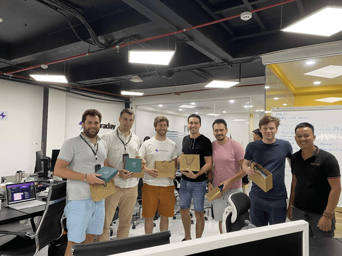
An Interview with Pharaday's CEO on Our Partnership
Learn why Pharaday partners with Designveloper. Thibault Court, CEO of Pharaday, discusses Designveloper's expertise and more.
DSV Universe
An Interview with Pharaday's CEO on Our Partnership
Learn why Pharaday partners with Designveloper. Thibault Court, CEO of Pharaday, discusses Designveloper's expertise and more.
DSV Universe
An Interview with Pharaday's CEO on Our Partnership
Learn why Pharaday partners with Designveloper. Thibault Court, CEO of Pharaday, discusses Designveloper's expertise and more.


Got
an idea?
Realize it TODAY