


When it comes to good web design, we often think of a visually appealing interface. But in fact, a well-designed website goes beyond aesthetics. It also covers usability factors like ease of navigation, fast loading speeds, mobile responsiveness, or content management. To help you create a modern successful website, we now will list the ten key elements of good web design you should consider in 2025.
The 10 Key Elements of Good Web Design to Consider
There are a ton of small things you need to do in order to create a high-quality website. Below are ten of them:
1. Call to Action (CTA)
What exactly is it that you would like your potential customers to do when they browse your website? Do you want more newsletter subscribers, make a sale, provide information, or gather contact information? Depending on your ultimate purposes, you can put calls to action (CTAs) in the right place to encourage visitors to take a particular action (like downloading a free document or filling out the form).
CTAs are often buttons, forms, and links with actionable text like Sign Up, Buy Now, Let’s Chat, or Contact Us. Take this stunning website which is one of our successful products as an example, its CTA is very obvious and strong. See the full website at luminpdf.com.
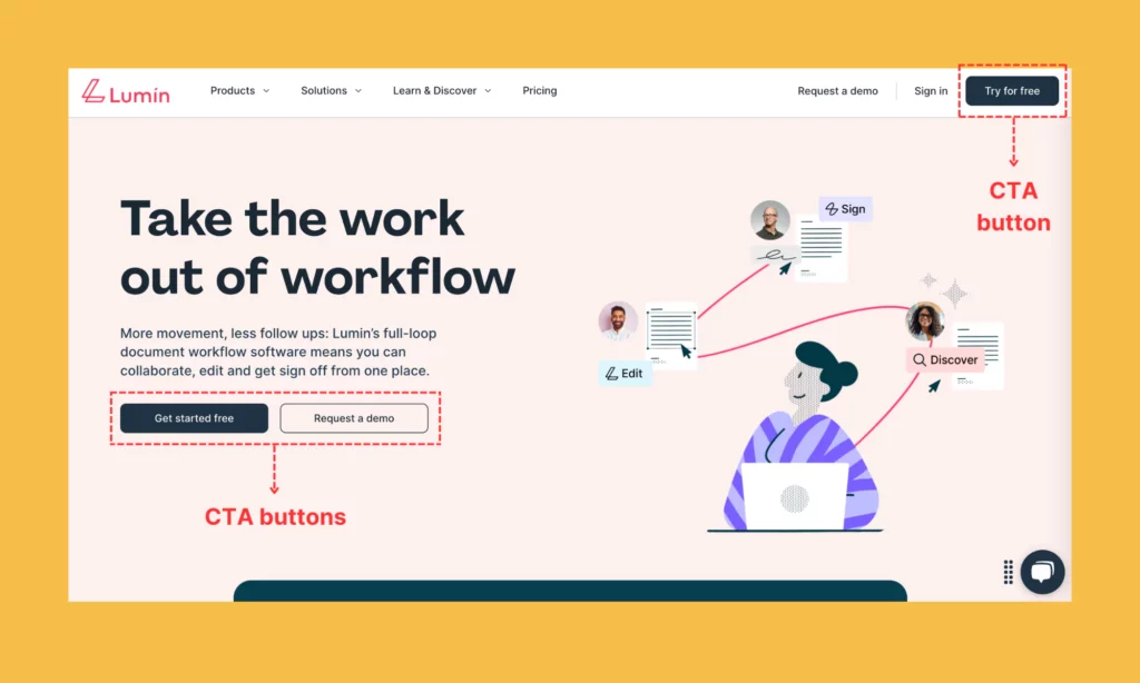
A successful website must have the ability to convert visitors quickly into customers. So make your CTA as clear and action-oriented as possible so that your visitors can take the next step. Below are some of our design tips to create a good CTA for your website:
- Use direct and clear verbs to create a sense of urgency and tell visitors exactly what to do.
- Leverage contrasting colors to help CTA buttons stand out from other elements on your page. Make the buttons large enough to click on with readable fonts, whether visitors are opening your site on their desktop, tablets, or smartphones.
- Avoid too many CTAs on one page; only place CTAs relevant to the page’s content.
Recommended reading: Why Web Design Is Important for Business?
2. About Us
Where to sell your story? Yes, no place else but the “About us” page. However, many people seem not to be aware of its importance. The “About Us” page is usually their second thought. But let us unveil a secret, that page is one of the most visited pages on a successful website! It provides your visitors with key information about who you are, what your mission and values are, and what sets you apart from competitors.
Therefore, it’s time for you to put some effort into making the “About us” page less boring. Do not write a long essay, just keep the page simple; give users just enough information instead. Here’s what you may include in the “About Page” section:
- Your company’s journey (e.g., how it started, its growth, and its future objectives);
- Mission, vision, and values;
- Key achievements and corresponding milestones;
- Profiles and visuals (e.g., images or videos) that showcase your key team members, office, or products.
And remember: your story should be personal, compelling, and definitely up to date. It needs to integrate some relevant keywords to help search engines index and rank your site easily. Further, put it in an easy-to-spot place, normally on the main navigation menu and footer.
3. Contact Information
We don’t know about you, but nothing drives us nuts more than a website that makes us revisit their pages so many times to find out how to contact them. Hey, we found your site, we like it enough to stay and we want to do business with you, but guess what? We can not find your contact information. Are you serious?
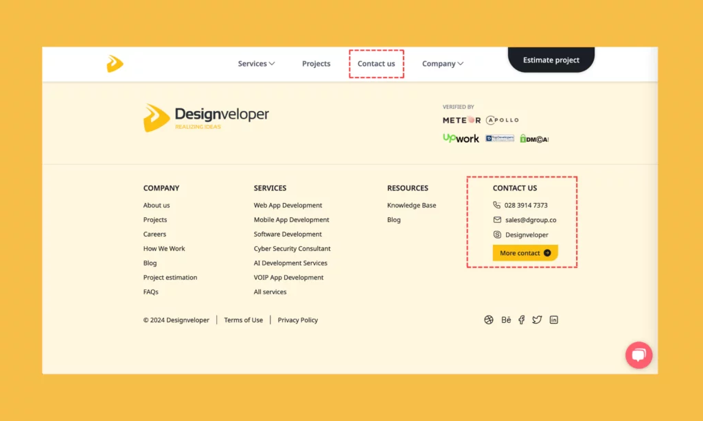
So, please display your contact information in a place where visitors can access with ease, no matter which page they’re staying on. You should also offer various options for potential customers to get in touch with you such as your email, your phone number, or a contact form. A good way to do this is to add contact information to all static headers and footers, like the way Designveloper does.
4. Simple Navigation
If you want to stand out from the crowd, good navigation is the key factor you need to take care of. Navigation isn’t necessarily complicated as people want convenience, not a challenge. The easier it is for visitors to use and navigate throughout your site, the longer they are likely to interact with it. Therefore, good web design should focus on simple navigation to help visitors easily find and access features or content they want.
So, how can you simplify a website’s navigation? Here are some of our best tips:
- Employ hamburger menus and a sticky header that remains unchanged at the page’s top. These methods not only help you save space but also make web navigation accessible.
- Investigate features thoroughly, and organize these features in a clear hierarchy, with main categories (“primary features”) and subcategories (“secondary features”).
- Predict whether any features are more likely to be added to the navigation in the future. This helps you ensure there’s room for expansion without compromising current features.
- Comply with design system guidelines to keep user experience consistent across a website.
Recommended reading: 5 Best Benefits of Responsive Web Design for Your Business
5. Responsive Design
There is no doubt that it’s the age of mobile devices now. Mobile seems to become everything surrounding us from doing business, checking emails, shopping, or even playing a game. One research has shown the global number of mobile users is forecast to reach 7.49 billion by 2025. Because of that insane usage of mobile devices, it’s a must for any kind of business to have a website that is responsive.
A responsive design means a website possibly adjusting or fitting onto any screen. When a website isn’t optimized to be viewed on smaller devices, your visitors have to zoom in and out, up and down, left and right to read the content. That’s obviously the last thing a customer wants when they are on the move and need to find out about your business.
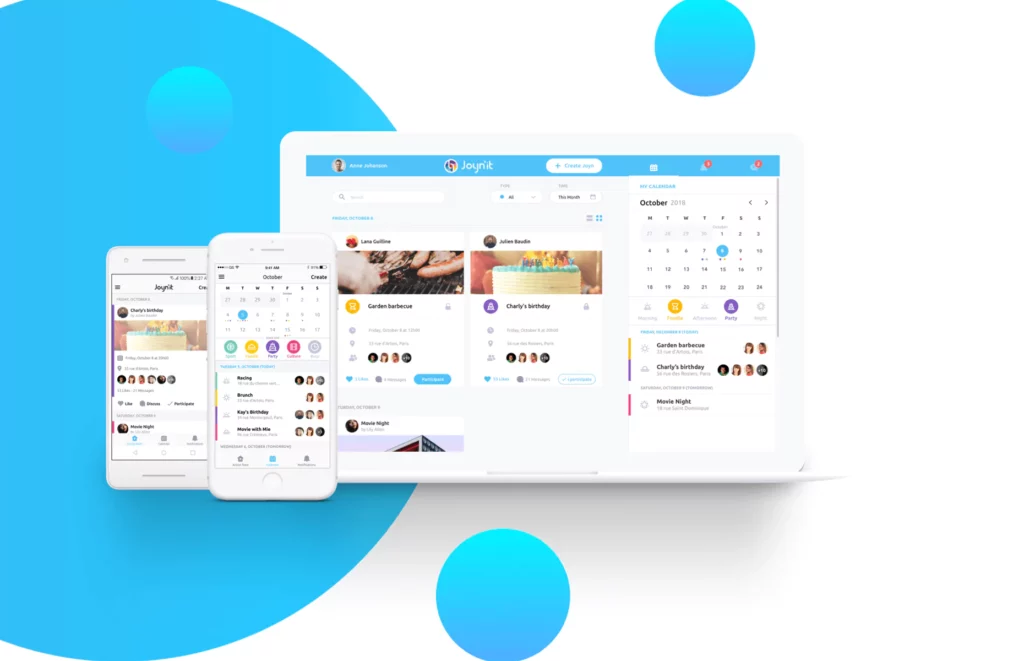
Here’s an example of how Designveloper helps Joyn’it build responsive design across platforms:
To make your website responsive across platforms, here are some of our tips:
- Design for mobile devices first, then scale up for larger ones. This helps you prioritize the most important features for mobile users.
- Use CSS Grid or Flexbox to build flexible grid layouts that can automatically adapt to screen size.
- Leverage fonts that can be scalable and readable on smaller screens.
- Keep buttons and links large enough for visitors to easily click on smaller screens. Also, ensure enough spacing between interactive factors to prevent unintentional touches on the screens.
6. Fast-Loading Page
What if visitors access your website and wait too long for it to load? Most people often choose to hit the “Back” button without regret. With the booming of the Internet, they can easily find any information or services to fulfill their specific needs. Therefore, it’s no wonder why the majority of web users will abandon a website if it takes longer than 3 seconds to load.
In other words, a single second delay in your page loading time can reduce conversions and user satisfaction rates. Plus, it negatively affects your site’s SEO ranking on search engines like Google or Bing. It’s because search engines find it easier to crawl and index faster sites, boosting their visibility in search results. So, if you want to design a successful website, consider its page loading speed.
Recommended reading: 5 Reasons Why Visitors Leave Your Website in 10 Seconds
7. White Space
If you visit a cluttered website, what will you do? The common reaction of most people is immediately leaving the site and rarely turning back. This is where you need white space to minimize visual clutter – we mean, to make your website’s content easier to read and digest.
White space, or negative space, is the area between visual elements (e.g., text or images) that is left empty. Contrary to common belief, white space isn’t necessarily white; it can be a background image or any color that leaves visual breathing room around the visual elements on your website. In other words, it helps attract attention to key messages and elements. Plus, a good use of white space improves the overall look of your website, making it more reliable and professional.
So, how can you create good white space for your website? Use grid-based layouts to keep spacing between elements consistent and align these elements evenly. Also, ensure white space can adapt well to various screen sizes by leveraging flexible padding and margins. These factors can adjust based on screen dimensions to keep your site’s layout clean.
8. Branding Consistency
Another key element of good web design in our today’s list is branding consistency. A website is your brand’s online representative. If you don’t consider branding consistency across the website, it’s hard for visitors to remember who you are. By using brand elements (e.g., logos, typography, colors, and imagery) uniformly, you can make the website easily recognizable and reliable to your potential customers.
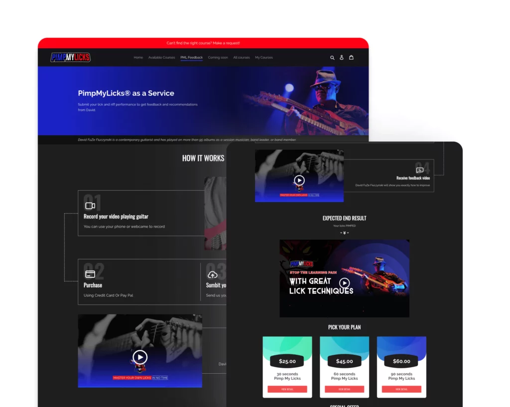
Below is how Designveloper helps Pimp My Licks achieve branding consistency across their website:
So, how can you ensure good branding consistency across a site? First, develop and follow a comprehensive brand style guide. This can involve how and where to use the logo, which color themes exactly represent your brand and how to use them across the site, etc.
Second, consider a consistent style for all visual elements (e.g., images or icons) and ensure cohesive design layouts across pages. Don’t forget a consistent tone of voice and messages across all site content.
In case you implement cross-platform design, ensure all the mentioned factors remain consistent across various devices and screen sizes.
9. Visual Design
Inevitably, good web design can’t exclude the aesthetics factor. Such visual elements as layout, typography, color, images, and overall style helps build an engaging visual experience on your website. A good-looking website not only improves first impressions but also makes your brand memorable and guides visitors around easily.
There’s a lot to do if you want to create a visually appealing design for your site. First of all, you should build a style guide and design system to keep visual elements consistent across the website or devices. Further, you should use grid layouts, coupled with white space, to keep all elements organized and balanced. Also, opt for legible fonts and complementary font pairs to create contrast while ensuring readability.
You should also consider high-quality images and custom graphics that reflect your brand identity. Besides, focus on mobile responsiveness when you design a website. This ensures a consistent user experience across devices, whether smartphones or desktops.
10. Relevant Content
A good website is the one that not only works effectively but also provides relevant content your audience wants. So, what does relevant content mean? Content here has to be audience-centric, catering the specific needs and interests of your potential customers. In other words, the content must answer the contextual questions of visitors by containing keywords that match their search intent and reflecting the latest development in the industry.
Once your customers have found what they have looked for, they are likely to return to your site to find answers to any further problems. Further, providing relevant content helps enhance your site’s SEO ranking on search engine page results. So, make sure all content is SEO optimized using relevant keywords so your targeted audience can find your site.
Improving Your Website Design with Designveloper
When it comes to building a website, every designer might have different plans, but there is no way to avoid including these above key elements of good web design. Have you ever heard the saying: “The devil is in the details”? Well, keep an eye on these factors because it’s the little things that can make or break your whole website design.
While your website essentially represents your business’s face, why don’t you take the time to make it shine? Want help getting your website to sparkle? Talk to our team to see just what we can do for you!
With years of experience and expertise in website design, we pride dedicated and skilled designers who have years of experience to tailor solutions for your needs. Besides our well-structured working model based on Agile frameworks, we employ many UX methodologies to improve product usability. These involve A/B testing, surveys, usability testing, and more.
Further, our past clients highly value us for our creative approach, on-time delivery, and requirement fulfillment. We also regularly stay updated with the latest design trends to provide cutting-edge solutions to our clients.
Wanna share your design idea with us and realize it? Contact us now!
Also published on

Share post on


Read more topics


