Lumin is a document platform that allows users to view, edit, and share PDF documents seamlessly. This fosters freedom of information and streamlines collaboration by integrating with cloud storage for universal access to documents, regardless of location. Lumin further promotes transparency and accountability by offering secure digital signatures, guaranteeing the legality and enforceability of contracts, agreements, and other formal documents.
Lumin’s estimated annual revenue is currently $12.9M per year. This revenue figure is expected to continue to grow in the coming years. Lumin’s success is not just about numbers; it’s about empowering users and upholding their rights. Our team’s meticulous attention to User Interface (UI) has been instrumental in driving revenue growth. We prioritize creating a platform that is not only user-friendly but also fully equipped with features that enhance accessibility and promote inclusive experiences.
To understand more about how Lumin designed its user interface (UI) to engender confidence and encourage wider adoption, please read our detailed paper on the subject. In this article, we’ll go over some tactics and examples we used to build a platform that is truly inclusive and user-centric.
Leveraging Google Material 3 Design Principles for Design System and UI/UX Design
Over the past two years, we have applied the principles of Google Material Design 3 in building our design system and UI/UX design.
To optimize the organization and management of the design system between teams within the same project effectively, improve the design handoff process to developers, and enhance the interactive user experience of the product.
Here’s how the Lumin team has implemented Google Material 3 Design Principles:
Material Design provides a set of standardized rules and components, which helps to organize and manage the design system easily:
Previously, the design system with the design team was just a set of simple guidelines/components. Now, with the latest rules and organization methods using variables from Figma, the design system has become more detailed, with consistent elements that can be shared among multiple designers, resulting in improved UX and accessibility.

In the past, designers would randomly use various colors based on their preferences, leading to inconsistencies between teams. (Designer A liked color 40, Designer B felt their design suited color 60, and Designer C used color 10). Overall, the UIs would lack uniformity, and the color scheme might have insufficient contrast and be unsuitable in some cases.
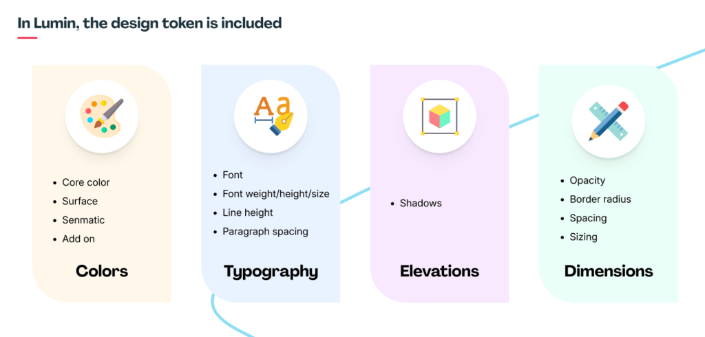
With the new system, the colors will be standardized, named, and their functions, contrast, and usage guidelines will be clearly defined. This provides a detailed and clear set of conventions for designers to use the right colors for the intended design purpose.
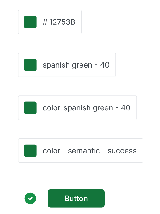
The design token design will be applied to the following basic components.
In the previous workflow, after the design was completed, the developers would need to manually view the design files and pick the color codes/specifications to build the CSS.

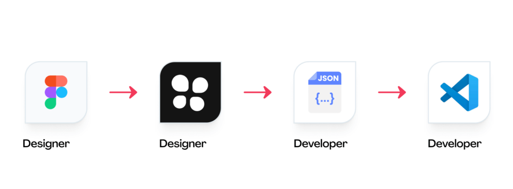
Now, the design team can use a plugin to export the design as a JSON file, which the developers can use directly, reducing the workload for the development team. The token values will be accurate and scientifically organized for convenient use.
FURTHER READING: |
1. Typography Trends for 2025 |
2. 5 Best Benefits of Responsive Web Design for Your Business |
3. 45 Web Design Terms: The Basic Glossary in 2025 |
Craft a multilingual and multicultural design interface to cater to a global audience
In the realm of user experience (UX) design, addressing the cultural and linguistic nuances of diverse user groups is paramount. As designers, we may not always share the same geographical, cultural, or industry background as our target audience. This can pose significant challenges if we fail to consider these factors when crafting our designs.
Creating a product without understanding the cultural and linguistic subtleties of our users can lead to usability issues and, in severe cases, even offend or alienate certain groups. For instance, I recall designing a basic file storage app for students in the US market. Our team lacked a UX writer, and the product owner was not American. Despite conducting online research and user interviews, we still made cultural and linguistic blunders.
American English has distinct vocabulary and writing conventions compared to British English. We ended up relying on our marketing and customer support teams in the US to review the app’s language. Fortunately, with the advent of online tools and AI-powered solutions, language barriers have become less of an obstacle.
As for cultural considerations, Western users generally prefer a minimalist approach with clear and concise buttons. Our initial designs, influenced by East Asian aesthetics, incorporated excessive details and colorful banners, potentially overwhelming users. To address this, we implemented feedback mechanisms, such as prompting users to rate and review the app after completing key tasks. Each month, we review these feedbacks and refine the app accordingly.
Optimizing the user interface to ensure compatibility with mobile devices
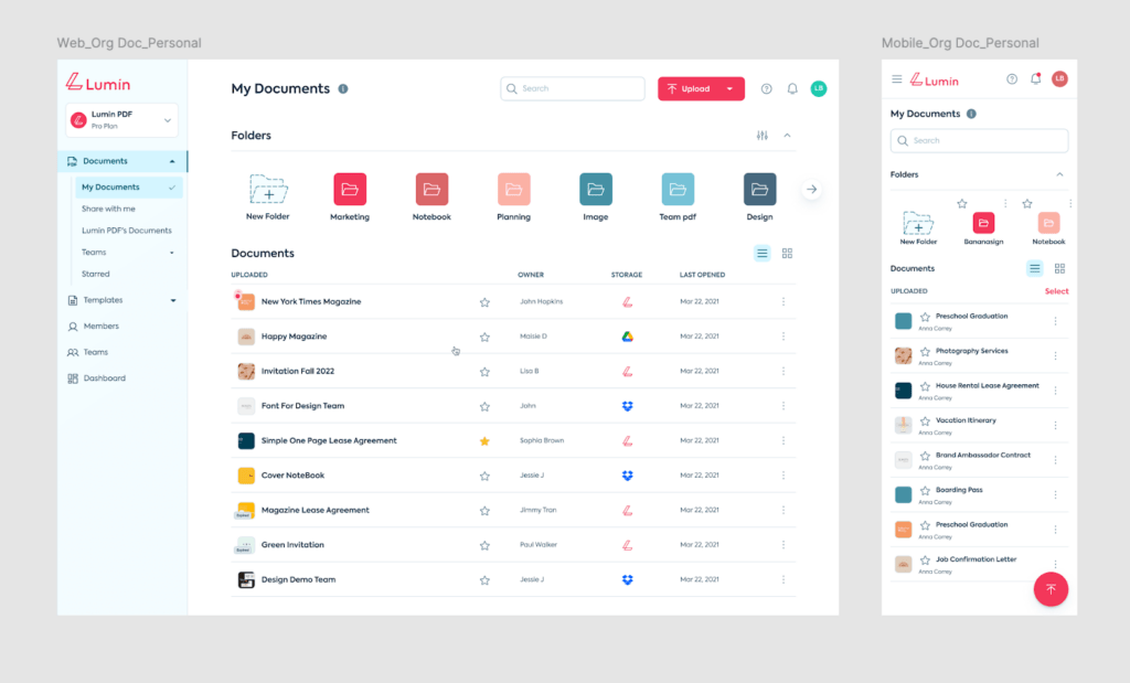
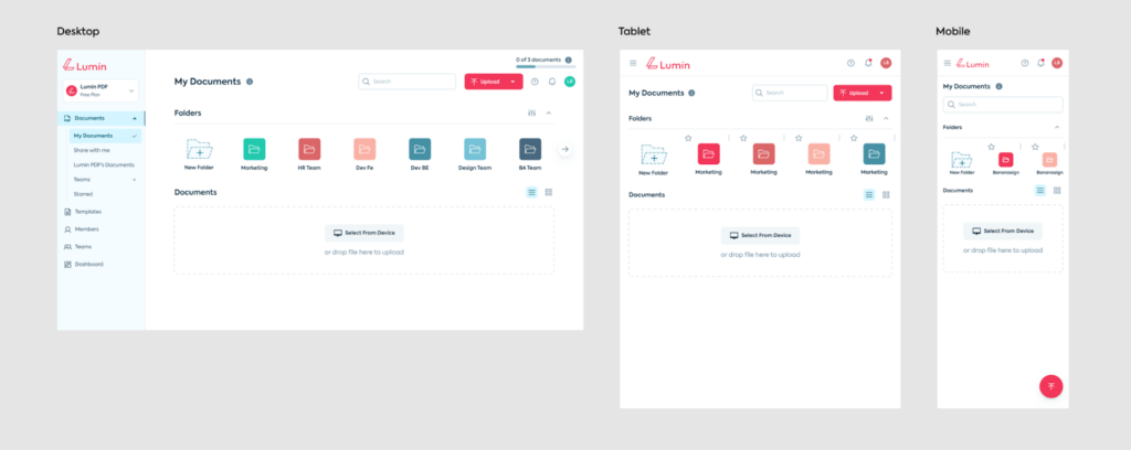
Optimizing the Lumin Document List interface for seamless responsiveness across platforms, from desktop to mobile, is critical for a smooth and consistent user experience.
Unlike the vast desktop environment, mobile devices have a restricted screen real estate. The objective is to have a consistent appearance and feel throughout the online and mobile versions, reducing the requirement for substantial bespoke design by the development team. The goal is to make sure that all content, element sizes, and call-to-actions are easy to reach and use on mobile.
Given the wide range of mobile device sizes, the designer should work with the Product Owner to collect data on the smallest device specs used by consumers. This data will assist the team in identifying the most frequently used features, allowing them to optimize the mobile design by removing extraneous pieces.
The design process should begin by adapting the layout to the smaller mobile devices, ensuring that all critical features are visible without a broken layout. Important elements will remain on the mobile layout, but unneeded functionality will be buried.
Font size, button size, and location are all important elements to consider when displaying them. For example, on the mobile version, the “Upload” button might be changed into a circular floating button that is always visible in the bottom-right corner and can be readily manipulated by the user’s thumb (with a minimum touch area of 48px, as recommended).
The end product should be two versions – web and mobile – with a cohesive visual identity, fostering a unified user experience across platforms.
After the design is complete, it is critical to test the interface on a variety of mobile devices to gain firsthand experience and receive feedback for any necessary changes.
Embrace Customer Feedback and Provide Compelling Solutions
After receiving user feedback on the “Drop files here” upload UI feature of the Lumin document, the client team has identified several areas for improvement:
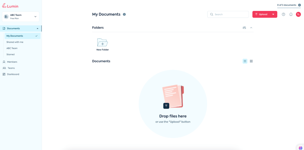
The primary concern was that the current design was not intuitive for users. Many mistakenly thought they could click on the illustration to initiate the upload, when in fact the only supported action was dragging and dropping files. Additionally, the size of the illustration and layout of the text below it meant the full content was not easily viewable on smaller computer screens, especially Windows devices.
To better understand the user experience issues, the team conducted research using tools like Hotjar to analyze user journeys and behaviors. This provided valuable insights, revealing that most Lumin users preferred uploading files directly from their local devices rather than dragging and dropping.
Benchmarking how other websites implemented their file upload features also helped inform the redesign process. The team then collaborated with the Product Owner to concept two new design approaches – one retaining an illustrative element, and the other taking a more minimalist approach.
After review, the client ultimately selected the simpler, more streamlined design. This solution adds a dedicated upload button and provides clearer instructional content while maintaining a compact layout that ensures full visibility even on smaller screens.
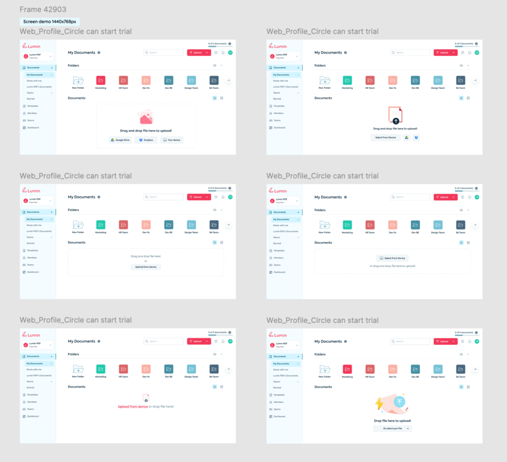
The goal was to create an upload experience that feels intuitive and focused, allowing users to quickly and easily upload files from their computers – the primary action they tend to perform. By addressing the usability pain points identified through user research, the team is confident the new design will provide a better overall experience for Lumin customers.
Conduct User Testing to Evaluate User Interface (UI) Performance and Experience
Conducting real-world user testing is crucial in product development. The data points shown in charts and graphs do not always address the actual problems users encounter.
For instance, when our team redesigned the interface of a simple document reading and sharing app. Before releasing it to end-users, we conducted user testing sessions and addressed major experience issues, making adjustments before proceeding to the next steps of product launch.
Finding suitable external users for testing was initially challenging, as it took time to recruit the right participants. A key principle is to never test on your own team, as that would compromise objectivity. Team members are already familiar with the product, leading to inaccurate results.
We prepared by writing a main usage scenario, asking users to follow it step-by-step and provide feedback at each stage. After the sessions, for crucial steps that were problematic, the interviewers would further probe users to understand their specific difficulties.
The software we used was Google Meet, which allowed us to record the users’ screens during the tests. These recordings were then reviewed to gain deeper insights into user behavior.
Following the testing, we discovered that most users struggled to locate the download button. Previously, it was placed differently, but after the redesign, its position changed. Reviewing the recordings, we noticed that users habitually looked for the download button in a menu, where they expected to find it like in other apps they commonly used. This allowed our team to optimize the button’s placement, improving the experience before releasing the product to the public.


Read more topics


