With the evolution of web design, you’ve probably well familiarized yourself with single-page websites. So did you know the single-page web design tips? They are super hot and popular and if you do right, your website could be a hit – no doubt about that! For those who haven’t known a thing about single-page websites yet, check the article below out for a deeper understanding.
Understand a Single-Page Web Design
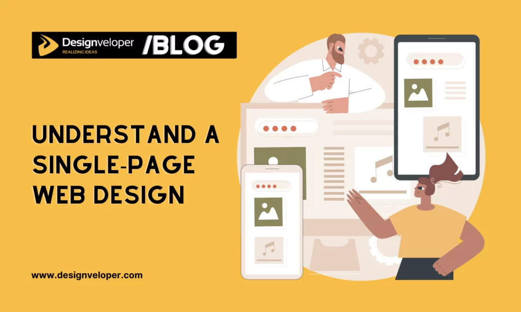
Before delving into our tips today, you first need to understand what single-page web design is. This is a modern approach to building your websites. Instead of having multiple pages with the main navigation, all the content is on one page. You can scroll or click through sections to find what you want.
Future of a Single-Page Web Design
Cognitive Market Research found that the global web design market will reach USD 56.8 billion in 2024. It then grow at a compound annual growth rate of 8.50% between 2024 and 2031. Along with this growth, the future of single-page web design also looks promising.
Why? This design style is clean, fast, and focused on delivering a seamless user experience. It’s now popular because it simplifies navigation and keeps users engaged without overwhelming them with too much information at once. In the future, we predict more businesses and designers opt for this design style for simplicity and speed.
As technology evolves, we’ll likely see more interactive elements that enhance user engagement. Single-page design may also become more dynamic, with features like real-time updates or more personalized content. The focus will remain on creating fast, responsive, and visually engaging experiences.
When trends shift, sing-page design will continue to adapt. This turns it into a strong choice for years to come.
Why Should You Master Single-Page Web Design Tips?
Understanding and mastering these tips are crucial if you want to create effective websites. These tips help you make the most of this design style. Without them, your site can feel cluttered or confusing. Further, they ensure your site remains user-friendly and visually appealing. With a single-page design, every detail counts. So, following the right guidelines help you avoid common pitfalls. Accordingly, you can design a website that looks good and functions smoothly.
The 5 Single-Page Web Design Tips that You Should Focus On
There are always certain things you have to follow through on when making any website. But when it comes to single-page web designs, there are five vital elements to keep in mind:
Recommended read: 5 Benefits of a Single-Page Website for Your Business
1. Prioritize Simplicity
Sometimes, less is more. With single-page sites, everything should be made as simple as possible for visitors (there’s not so much room for you to clutter up anyway). Take a look at Aqualitis, a typical example of a simple design:

When visitors access your page, they want to get what they are looking for right away. Who has got the time to read volumes of text unless a person is here to read a novel? Single-page sites give you only one shot. So, instead of beating around the bush, make sure your content is essential, short, and readable.
To make sure it works, I highly recommend you give yourself a few seconds to go through your own site and answer these questions: Is your main message clear and strong enough? Is the crucial information, especially your contact info, easy to find out? Is your site interesting enough to keep you staying? Then, you get your answers!
2. Consider Easy-to-use Navigation
Why does a single-page website need a navigation bar since all things are in one place?
Good question! It’s because everything is placed in one large room that a navigation bar makes sense. The navigation of the page will be linked to some particular sections of that page. Visitors just need to click on any of navigating links, the page will do its job of bringing them to that particular section.
Even though visitors can go there by scrolling the mouse and taking the journey on their own, you still need to have navigation to keep your website user-friendly. Below is a good example of how a single-page site is easy to navigate:
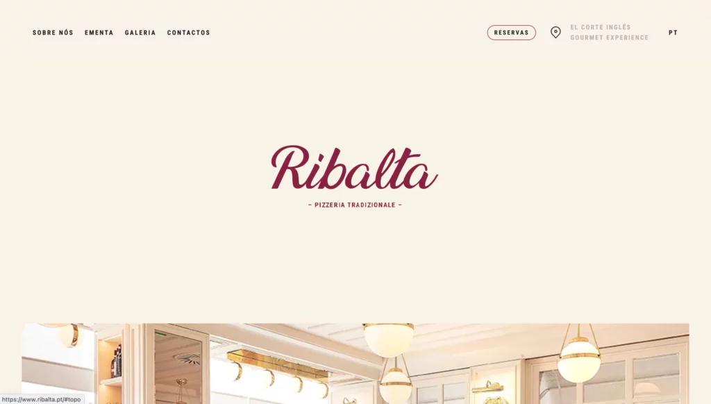
One more thing to add, your aim is to keep the navigation clear and easy to use. So don’t redirect your visitors to an external website without any warning as it can be confusing. If you must do so, consider using icons or headings to let them know where they are being redirected go.
3. Add Lively Engaging Elements
It’s crucial to give your single-page site a sense of life and motion. Making new elements come out and then others disappear when your visitors travel through the site will grab their interest and retain them longer. The single-page website of Café Frida is a typical example for adding engaging elements:

No matter how brilliant your content is, if you don’t break up long text with those unique effects, navigating through the site becomes monotonous and visitors may leave out of boredom.
Instead of making some motion effects, you can also change background colors for a better user experience. It’s hard for visitors to determine where each section begins and ends if your sites use a single color. Let’s think outside the box and make your site memorable!
4. Ensure Responsive Design
Even with a single-page website, making it responsive is essential. A responsive design adjusts to different screen sizes and devices. This ensures your content looks good whether visitors are on a smartphone, tablet, or desktop. Focus on making your site easy to navigate on any device. Ensure buttons are clickable, text is readable, and images are properly sized.
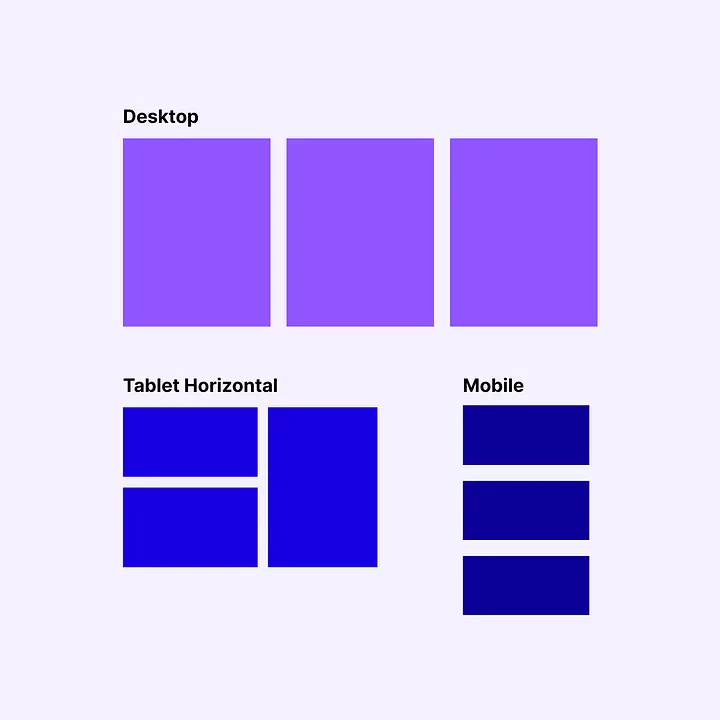
What if your website has large volumes of data that are difficult to display on small screens while still ensuring complete information? In this case, our advise is to analyze and designate some data as key values. On smaller screens, key value data should be always prioritized for display. Meanwhile, less important data will be placed in a scrollable area. This helps convey important messages to visitors while retaining complete information. Here’s our typical format to display information across devices:
5. Optimize for Speed and Performance
No one wants to spend time on a slow-loading website. Visitors can immediately get our of this website before they even see your content. To keep your site fast, optimize images and compress files. Avoid using too many heavy scripts that can bog down performance. Don’t forget to check how your site loads on different devices and make adjustments as needed.
A fast, responsive site ensures that visitors have a smooth experience, no matter what device they use. When your website performs well, visitors are more likely to stay and explore.
Conclusion
I hope this post has inspired you to make a perfect one-page website for your business! In case you’re interested in having a professional designer help you with your one-page website, don’t hesitate to give Designveloper a call. We’re here to help you!
Do you have your own special single-page web design tips? Leave a comment and let me know.


Read more topics


