
We have seen a big change from big desktop computers to small, portable mobile devices, especially with the rise of wearables in the past few years. So, there’s no reason for the tech industry to think that other technologies, like front-end web development tools, will go through the same big changes. How will this part of the market be made? This issue will be predicted in the article from Designveloper.
Where Is Frontend Web Development (Fwd) Headed?
“Is front-end development on its way out?”
This question was asked on Quora, a large social Q&A site, many years ago. Early in 2021, the same problem was also brought up on Reddit.
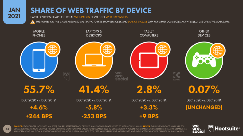
In fact, many people worry that front-end web development will be a job that no one wants. But this end-of-the-world scenario will never come true. We Are Social and Hootsuite’s 2021 Global Overview Report says that browsing the web is a very popular thing to do on all kinds of devices. Even things that people think can only be done on social media apps are mostly done on mobile websites. About two-thirds (1.8 billion) of all unique visitors to websites come to Facebook each month.
Recommended reading: The Future of Web Development: Exploring the Power of Web3 and Blockchain
Stunning numbers
These numbers show that web development is still in high demand once people can use websites. Instead, you should be aware of how the role of front-end web developers is changing.
Compared to the last 10 years, the sector has changed in a way that is more complicated. Core web design tools like HTML, CSS, and JavaScript have been joined by a lot of new technologies, languages, frameworks, and libraries. Customers expect to use products and services in real-time, so this is a natural result.
Since the field is getting more complicated, you could say that modern front-end developers have more tasks to do. But no matter how the field changes, making interfaces that are easy to use will always be the goal.
Also, there is a rumor that frontend developers won’t have to code websites in the future because this will be done automatically. Even if this happens, they still need to be part of the web development process and web design process. The main point is that their jobs will keep changing a lot, and they will have to keep getting better at what they do to fit in with the new market. We still have a long way to go, though, before this theory can be proven.
Recommended reading: Web Design Business: How Difficult Is It to Start?
Implications of a Mobile-First Approach (In Front-End Web Development)
A mobile-first principle means that designs for mobile devices are more important than desktop versions.
In contrast to what most UI and UX designers and customers think, the majority of browsing is done on mobile devices. The research on digital users that was mentioned backs up that claim. There are fewer people using desktops and laptops, while the number of people using mobile phones is growing. So, companies whose customers mostly use small screens will benefit from putting more effort into them.
Also, this method lets front-end developers avoid the problems that come with moving designs from desktop screens to mobile screens. In the future, they won’t leave out any important parts of the mobile app design process.
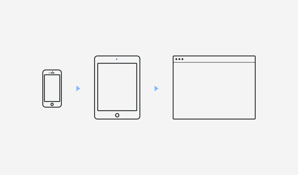
But there are some things that can’t be done with a mobile-first approach.
First of all, a mobile design is different from a desktop design in many ways. For example, it’s in how the content is organized, whether the navigation is vertical or horizontal, and how it works with phone or desktop functions. This method takes a lot of time to learn about new design specs and mobile app design software tools.
The lack of space and freedom to be creative is another problem. So that designers can put customer-driven content and load speed first, they have to give up some creative features.
Recommended reading: Top 6 Best Front End Developer Courses With Certificates
Benefits of Mobile-First Approach
Using a mobile-first design strategy has a number of benefits, such as:
- Approach More Customers: As has already been said, most web traffic comes from mobile users. Also, a lot of different websites, from social networks to e-commerce to e-learning, have mobile-based activities. So, if you want your business to get more customers, designing mobile interfaces first is a good idea.
- Prioritize Content: Because mobile screens are small, only the most important information will be shown on mobile versions of websites. This lets your customers know what your company wants them to know.
- Speed up Load Times: A mobile-first approach focuses on the most important parts of a website to give visitors the best experience. This will get rid of content and elements that aren’t needed, which will make load times faster.
- Integrate with Mobile Functions: Many people find it more convenient to use a website that is mobile-enabled because its features work with the main functions of mobile phones. For example, when a customer visits an online shop, she can call the shop assistant by clicking on the phone number posted on the site. The same is true when she looks up the store on a map or pays with an e-wallet.
A mobile-first strategy will help designers and developers make sure they don’t forget to think about these important features when making a website.
- Build a Responsive UX: This stage is the first step of the UX design process. If desktop versions of websites are made first, it will be hard for developers to make responsive mobile versions. This is because users do different things on each version. So, putting mobile designs first will help your company make a more user-friendly interface and improve their experience on that.
Recommended reading: Front-End vs Back-End: Which Suits You Best?
Future Trends in Frontend Development
Following the web design trends in front-end web development from the past few years, we’ve seen the following technologies and trends take over:
1. HTML5 and CSS3
HTML/CSS is likely to be a language of the past. But their fifth HTML and third CSS versions are still very important for designing and building websites.
HTML5 and CSS3 are used in all open-source and cross-platform systems, whether they are made for desktops or mobile devices. HTML5 and CSS3 have more attributes and elements than previous versions, which makes it easier to make a website that works in all browsers.
Along with CSS3, HTML5 adds to, improves, and expands markup and the web application programming languages interfaces (APIs) to make it easier to build complex web apps that are still easy to use. Also, front-end web development is made easier by many new features, such as responsive images, videos/audios, web sockets, and more. So, developers can make a website that is easier to use and more interactive to keep more visitors interested.
2. JavaScript Frameworks and Libraries (in Frontend Web Development)
JavaScript still tops the list of the most used computer programming languages, just as was expected. In a recent StackOverflow poll, 69.7% chose this technology.
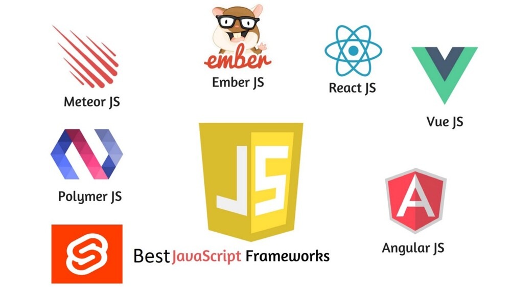
When only looking at JavaScript frameworks and libraries, jQuery and React are the ones that front-end developers of all skill levels use the most. This is followed by a version of Angular that uses both Angular.js and Angular 2+ (25.1% of the total) and Vue.js (25.1%). (17.3 percent ).
Many experts warn that new technologies may make these JavaScript frameworks and libraries less useful in the future. Others, on the other hand, are still optimistic about JavaScript’s future because the number of JAMStack websites keeps going up. The parts of this word are JavaScript, APIs, and Markup. This mechanism makes it easier to make web apps that work well, but the web app development cost doesn’t cost too much. Next.js, Nuxt.js, and Gatsby are all parts of this software architecture.
Recommended reading: Why Learn Javascript Help You Make a Lot of Money
3. Responsive Design Methodologies for Mobile-First Websites
Developers came up with the idea of responsive web design to handle development tasks on devices with different screen sizes. Today, more and more of its methods work in “mobile-first” layouts. Among the most common UI design principles are:
- Set up meta viewport tags to help browsers change how pages are scaled and how big they are.
- Use different layout methods, like Grid, Multi-Column, or Flexbox, to make layouts that can be changed easily to fit the viewport.
- Use CSS media queries to change the size of things based on what the devices can do.
- Instead of landscape orientation, think about vertical scrolling when designing for mobile-first.
- Set up all UI elements so that users can reach them with their thumbs.
- Focus on functions that can be done with a touchscreen instead of those that require a cursor.
4. New Technologies and Techniques for Modern Web Design
In the past few years, people have become more interested in new technologies that could make JavaScript and its frameworks less popular. There are a lot of programming languages used by top companies that are more popular.
A survey by the State Of Frontend found that 77.2% of developers were already using TypeScript and thought it was better than JavaScript. No matter if they are working on old frameworks like Angular or React or new ones like Dojo or Stencil, TypeScript improves their coding process and makes it easier to build complex web applications.
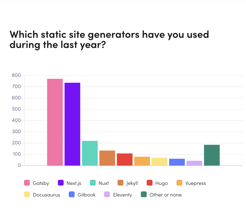
Some of the next-generation frameworks that are getting more attention are Dojo, Stencil, and Svelte.
The Dojo is being rewritten as a modern TypeScript framework with some out-of-the-box features. Those will help build responsive, efficient architecture and support scalable deliverables for large enterprises.
Stencil focuses on custom web components to build fast and responsive web apps. It has standout features like Async rendering and Virtual DOM.
Svelte, on the other hand, is an open-source front-end compiler that tries to add responsiveness to standard DOM structures.
These technologies work well for small projects, but it could be said that they require more work for large web applications. Still, their features are in line with modern web design standards, so they may be successful in the frontend development segment.
Recommended reading: Is Web Development Dying in 2023? Or Just Evolving? Here’s the Answer
5. Summary
As the number of mobile users has grown, there has been a shift toward designing for mobile-first. Front-end developers are becoming more and more interested in next-generation technologies that make their jobs easier and websites more responsive. HTML5, CSS3, and JavaScript are still the most important parts of front-end web development, though. So you can’t undervalue how important they are.
Future of the Front-end Web Development?

1. The Future of the FrontEnd Web Development in 2020
The 2020 StackOverflow survey showed that more and more people are using TypeScript. It beat Python to become the second most wanted technology. It was hard to get people to use Svelte in 2019, but it took off the next year. Over the past three years, static sites have continued to use JAMStack, and this method was thought to be on the rise.
Even though there were a lot of new technologies in 2020, the market for front-end development was still dominated by older technologies. They all worked toward making websites that work well on mobile devices. This trend was first noticed in the 2000s, but Google’s announcement of mobile-first indexing in 2018 brought it to more people’s attention. As the number of mobile users grew, it was no surprise that mobile-first websites with responsive design stood out in 2020.
2. The Future of the FrontEnd Web Development in 2019
When we looked back at the important trends and news of 2019, we saw that the most popular JavaScript frameworks with new releases were jQuery, React and React Native, Angular, and Vue. After the W3C Consortium made its announcement, WebAssembly became the fourth official language for building websites. So it’s not surprising that it worked.
Even more obviously, TypeScript had a big year. According to the 2019 StackOverflow survey, the most popular technologies or web development languages are now TypeScript, Python, and Rust. For some projects, some developers even liked it better than JavaScript.

At the same time, progressive web apps have been on the rise this year (PWAs). A lot of people even thought that PWAs could replace native mobile apps.
3. The Future of the FrontEnd Web Development in 2018
In JavaScript, there were clear trends and events in 2018.
The first one was related to WebAssembly, which is a binary format that runs with JavaScript to improve web performance, reduce file size, and allow web development in more than one language. In late 2017, all of the major browsers, like Mozilla Firefox and Safari, were able to use this technology. After its Web API, JavaScript interface, and core specification version 1.0 came out in 2017, people thought WebAssembly would stand out in 2018.
React was still one of the most popular frameworks for JavaScript. Its version 16.4.0 came out with new features like lifecycle methods, and React. memos, and pointed events. React Hooks and Suspense API were two of the most important.

Vue has also changed. Even though React and Angular were more popular than this framework, it was thought that it would one day be more popular than React. In the same year, the seventh version of Angular came out, and this tool was still a popular choice for professional projects.
Other frameworks, like Next.js, Nuxt.js, Vue CLI, and Expo CLI, were also used more. This is because the CLI packages freed developers from having to manage the tools, so they could spend more time making web apps.
Conclusion
HTML5, CSS3, and JavaScript are still the building blocks for front-end web development. Also, web frameworks and languages are rearranged every year based on how popular and interesting they are. No matter what technologies and methods are used, they are all made to improve the online portal experience for users as much as possible. Also, it’s still too early to talk about automating front-end development. So, people are still very important in this field.


Read more topics


