Data now is a gold mine for various businesses. It helps with revealing meaningful insights, forecasting trends, and ensuring operational efficiency. That’s why more and more businesses are investing in powerful data analytics tools and techniques to harness the full potential of data. This growing demand has propelled the global value of these tools, with an estimated $303.4 billion recorded in 2030.
With the right software and techniques, your business can convert raw data into actionable strategies that lead to success. So, how can you choose the best one? What are the most promising tools and techniques available to consider? Let’s find the answers in today’s article.
Top 10 Data Analytics Techniques
Data analytics techniques now can be divided into two main categories based on their use: Quantitative and Qualitative. Let’s discover what they are and how they can help with data analytics:
Quantitative Data Analytics (QDA)
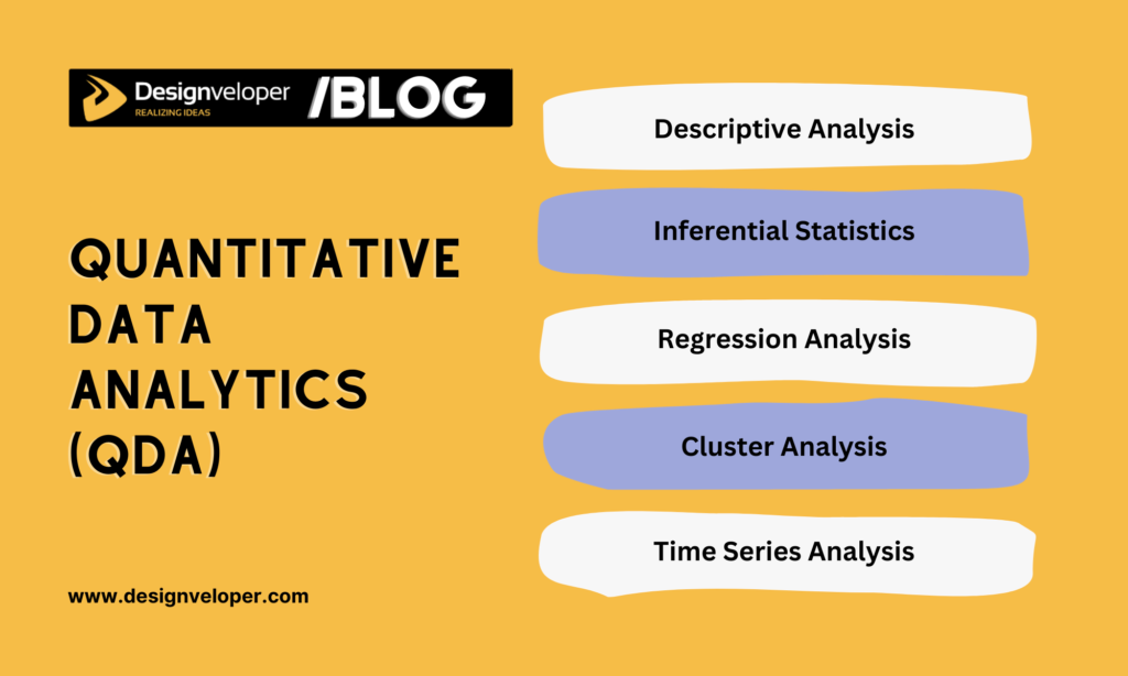
QDA involves assessing numerical data to quantify relationships between variables, derive measurable insights, and predict trends numerically.
It helps you answer the “what” question by analyzing data types like sales figures, survey responses with numerical scales, or website traffic metrics. For example, QDA discovered that 60% of this month’s sales come from Christmas crafts.
With this functionality, QDA is crucial when you want statistical insights and exact measurements for decision-making. Below are five common QDA techniques:
1. Descriptive Analysis
This QDA method involves summarizing and organizing data points in a constructive way. It uses measures of central tendency (median, mean, mode) and variability (standard deviation, variance, range) to summarize vast datasets and detect general trends. In other words, it focuses on describing and analyzing data characteristics and changes without giving any further conclusion. The data analyzed can be presented in tables or graphs.
Designveloper’s team often employs Descriptive Analysis (DA) to implement data analytics. One typical example is when we worked on an eCommerce website for household appliances. The client wanted to understand sales trends and discover their top-selling products during a three-month marketing campaign (April to June 2023). This data would be helpful for optimizing marketing efforts for these products.
Through descriptive analytics, we concluded:
- Total sales during this period were VND 1.2 billion;
- The best-selling product was portable fans, generating VND 223 million (equivalent to 17% of the total revenue). It was followed by air conditioners, generating VND 128 (with an average order value of VND 6 million).
- Customers were mainly between 25 and 50 years old, with 40% being male and 60% female.
2. Inferential Statistics
This QDA technique focuses on analyzing a small, representative sample to draw conclusions or make predictions about a larger population. Its main goal is to identify differences or relationships in data to gain insights beyond an immediate dataset. So, when population data is unavailable or when analyzing an entire group is time-consuming and costly, inferential statistics proves helpful.
For example, a healthcare facility surveys 1,000 patients (the sample) out of its 100,000 total patients (the population). If 60% of the sample shows satisfaction with the facility care service, they may conclude that roughly 60% of all patients are satisfied.
Several common methods you may use for inferential statistics include confidence intervals, hypothesis testing, and t-tests.
3. Regression Analysis
This quantitative data analytics technique involves determining correlations between variables. In other words, it identifies how one or more independent variables predict a dependent variable.
For instance, your company wants to evaluate which factors impact employee productivity (measured as weekly output) and forecast productivity levels for future recruitment. So, independent variables (“predictors”) might be hours worked per week, years of experience, and number of training sessions attended.
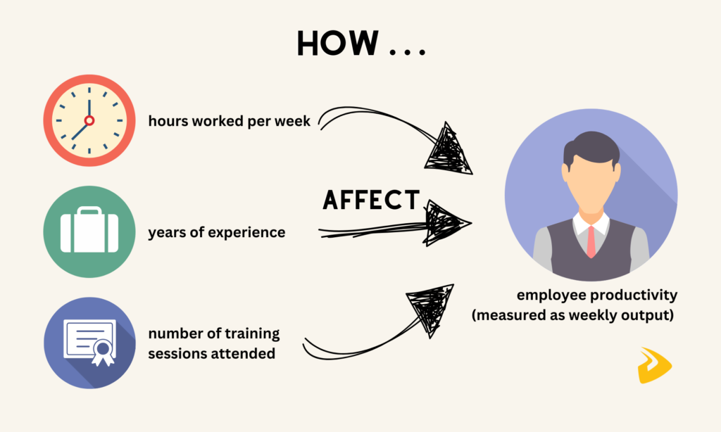
As a data analyst, you perform a regression model to see how these variables help predict weekly output (a “dependent variable”). The results can be:
- Every extra hour worked boosts weekly output by 0.5 units.
- More experienced employees generate 2 extra units per week for each year of experience.
- For each training session attended, productivity increases by 2.5 units.
With this capability, regression analysis is ideal for predicting future values, determining the most crucial influencers, optimizing outcomes, and testing hypotheses.
4. Cluster Analysis
This technique refers to grouping similar data points into segments based on factors like demographics or behavior. It works best with categorical or quantitative data which, however, still need preprocessing. Some algorithms like K-Means, DBSCAN, or hierarchical clustering are commonly used to support this data analytics technique. Further, you can leverage metrics like the Davies-Bouldin Index or Silhouette Score to verify clusters.
So when should you use cluster analysis? It works well when you need to determine patterns in unlabeled data, simplify complex datasets, and make recommendations for different clusters. For example, a retail company groups its customers based on their age, annual income, and spending habits to design targeted marketing campaigns.
5. Time Series Analysis
As the name states, time series analysis helps analyze data recorded or amassed at certain time intervals.
It helps identify and predict trends (e.g., stock prices or future sales), as well as understand recurring patterns (e.g., higher Christmas decor sales in December). The technique is also ideal for analyzing the influence of events (like “How can a promotional campaign impact monthly sales?”) and detecting anomalies (like “a sudden increase in website traffic”).
Some common methods used in time series analysis include Decomposition (dividing the series into components like seasonality) and ARIMA (modeling and forecasting future values).
However, when working with time series analysis, you should ensure data is time-ordered and evenly spaced (e.g., hourly or daily). Further, the series needs to be stationary, which means statistical characteristics like mean or variance don’t change over time. For example, monthly sales remain consistent at around 1,500 units without a significant increase or decline.
If the series is non-stationary, it’ll increase complexity and make data analytics less accurate. In this case, you need to transform the data to ensure stationarity.
Qualitative Data Analytics (QualDA)
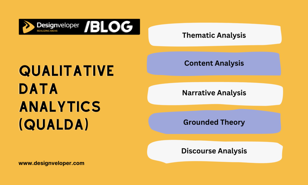
QualDA refers to analyzing non-numerical data to acquire a deep, contextual understanding that helps address root causes.
This data analytics method answers the “why” question to identify the underlying meanings, motivations, and context behind statistical findings. Unlike QDA, QualDA focuses on data types like textual information from interviews or surveys and video/audio recordings. For example, it digs into social media posts and comments to discover how people feel about your customer service.
Below are five common QualDA techniques to consider:
1. Thematic Analysis
Data analysts leverage thematic analysis to detect, report, and interpret patterns (“themes”) in data. This analytics technique often involves some tasks like coding data or clustering similar codes.
- Coding data means systematically tagging specific groups of qualitative data with descriptive labels (“codes”). For example, when a company collects an open-ended survey response for its learning platform, “The video quality is excellent, but the search feature is confusing.” So, Code 1 is “Positive: Video Quality,” and Code 2 is “Negative: Search Feature.”
- Clustering identical codes into broader themes. For instance, codes like “Video Quality,” “Course Variety,” and “Instructor Expertise” can be grouped under the theme “A Learning Platform’s Strengths.”
The example above shows how thematic analysis helps you identify strengths and areas for improvement. This guides product development and informed decision-making.
2. Content Analysis
This qualitative data analytics technique helps you systematically classify and analyze content within unstructured or semi-structured data. The content here might be textual, visual, or audio (for example, articles, videos, or advertisements).
Content analysis is helpful for detecting the underlying patterns, discovering keyword frequency, and interpreting meanings from content.
For example, a company wants to examine how customers feel toward its new product by collecting reviews from its eCommerce website and external sources.
Analysts then code these reviews into categories (e.g., the review, “Delivery took longer than expected” is put under the “Delivery Time” code). They then measure how often each category appears across all reviews. Suppose Delivery Time is mentioned 60 times, which indicates that delivery is a recurring problem and needs improvement.
3. Narrative Analysis
Narrative analysis is helpful if you want to analyze personal experiences, stories, or accounts shared by individuals to interpret their perspectives and emotions. Unlike content analysis, narrative analytics focuses on data with richer, longer-form descriptions. It helps explain how people make sense of specific events and form relevant meanings.
For example, a healthcare provider wants to better understand how patients experience care. They conduct in-depth interviews to collect patient testimonials on treatment experiences and hospital stays.

Through their story of hospital visits, analysts identify the narrative structure (beginning, middle, end). They then label different parts of the story with codes like “Positive Interaction with Staff” or “Waiting Anxiety.”
Analysts continue discovering how the sequence of story events impacts a patient’s perceptions and sentiment (like “Positive interactions with medical staff before and after a surgery build a sense of comfort and trust”). This analytics gives the provider a meaningful insight (like “Good communication during waiting times and after procedures can foster patient satisfaction and reduce anxiety”).
4. Grounded Theory
If you want to develop new theories or frameworks based on qualitative data instead of testing existing ones, grounded theory is a helpful technique. It’s suited for situations where there’s a limited understanding of a specific event or where the data is complicated and requires detailed analytics to uncover latent patterns.
This methodology works by continuously comparing data points that are not yet fully understood to create new theoretical insights.
For example, a tourism agency wants to understand what factors affect employee motivation but has no clear theories to interpret this. So, they conduct in-depth interviews and ask open-ended questions.
Once having interview transcripts, analysts divide them into small groups which are tagged with relevant codes based on their meaning (e.g., “Managerial Support”). By grouping codes with similar traits and identifying their relationships, analysts discover emerging themes (e.g., those receiving managerial support and positive feedback are more motivated).
Based on these themes, analysts build a new theory or framework: “Supportive managers and positive feedback increase employee motivation.” This model helps the healthcare provider take informed action to improve employee motivation (e.g., building better feedback systems).
5. Discourse Analysis
This data analytics technique helps examine how language and communication shape cultural influences and societal norms. It analyzes spoken conversations and written materials, focusing on their tone, structure, and hidden meanings.
So, how does discourse analysis work? Let’s take a hypothetical example of how a tech company’s public relations (PR) team handles a significant product recall:
First, the team analyzes the language used in the media coverage (e.g., news articles) to determine:
- Which specific words/phrases are being used to describe the crisis? Example: “defect,” “malfunction,” and “crash.” These word choices may strongly affect public perception.
- Which emotional tone is being used in the media coverage? Example: negative, positive, or neutral. This tone helps the team understand public sentiment.
The PR team also uses social listening tools to track how customers think of the product recall and the company on social media. Based on insights from the discourse analysis, they can customize messages, choose appropriate language, and use effective channels to address the crisis.
Top 10 Data Analytics Tools
Besides those techniques, data analysts also employ different tools to support their effective data analytics. Below are the best data analysis tools you should consider:
1. Tableau
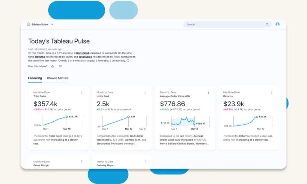
Tableau is the world’s best self-service analytics and business intelligence platform. It can be deployed on-premises, in the cloud, or natively integrated with Salesforce CRM to support data preparation, analysis, security, and governance. Coupled with AI capabilities powered by Salesforce Einstein, Tableau can ease and expedite every stage of data analytics.
Features
- Support data analysis with Tableau Agent. Built on the Einstein Trust Layer, this conversational AI chatbot supports new analysts in preparing data effortlessly, creating automated descriptions for data assets, and generating visual reports.
- Drag and drop graphical elements to create visualizations. Using VizQL, Tableau’s drag-and-drop interface helps with building graphs, scatter plots, maps, and other visual presentations. These visualizations help communicate data insights and track KPIs effectively, even when you have to deal with large, complex datasets. Further, this interface blends data from different sources and enables real-time analytics.
- Make data more accessible with Tableau Pulse. This powerful tool delivers contextual, personalized insights and predicts trends using AI. Its Tableau Pulse’s Metrics Layer helps develop standard definitions for your KPIs and metrics to ensure data quality and accuracy.
- Use Tableau Data Stories to automatically explain data. This feature uses rules-based natural language generation to interpret what data presented in interactive dashboards means.
- Scale data architecture. When you develop a data model or analytics, you can reuse it across projects without starting over. As your business or demand grows, you can reuse or modify this model instead of building another from scratch.
Pricing Plans
| Package | Pricing (billed annually) |
| Self-Service Analytics for Teams(a comprehensive software package) | – Tableau Creator: $75/user/month- Tableau Explorer: $42/user/month- Tableau Viewer: $15/user/month |
| Tableau for the Enterprise(an advanced software package) | – Enterprise Creator: $115/user/month- Enterprise Explorer: $70/user/month- Enterprise Viewer: $35/user/month |
2. Power BI
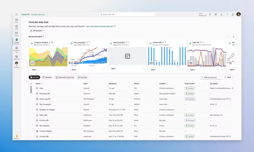
Power BI is a Microsoft-developed software package that focuses on business intelligence and data visualization. It includes a Windows desktop app (“Power BI Desktop”), an online SaaS service, mobile apps, a report builder, and a report server. All these tools work together to convert unrelated data into actionable insights and generate reports or dashboards.
Features
- Transform your data into visualizations. With built-in AI capabilities, Power BI can create visuals and reports from data collected from different sources. These interactive visuals help you dive deep into the root causes, trends, and anomalies behind a specific event.
- Manage all data in OneLake. This repository enables you to store, analyze, and manage all your company’s data in a single, unified place.
- Integrate with Microsoft Fabric and other Microsoft apps. This capability allows everyone in your team to access and share data, insights, and reports across tools, unlocking data-driven collaboration and boosting productivity.
- Use AI features to enhance data analytics. AI capabilities help with discovering patterns in data, building reports promptly, answering questions, etc.
- Use Copilot to increase transparency and context awareness within data. This generative AI tool can summarize the underlying semantic model, suggest content for a report, generate visuals, etc.
Pricing
- Free account
- Pro: $10/user/month
- Premium Per User: $20/user/month
- Power BI in Microsoft Fabric: variable
3. KNIME
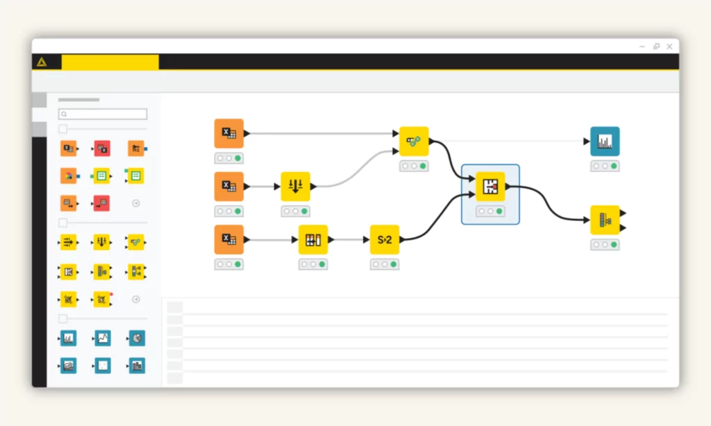
KNIME is a free, open-source data analytics tool developed by software engineers from the University of Konstanz in 2004. It incorporates many tools, frameworks, and libraries for data analysis and machine learning tasks. KNIME works on the “Building Blocks of Analytics” concept which divides complex workflows into smaller components (“nodes”).
Features
- Use a drag-and-drop interface to simplify data processes. You can simply drag and drop nodes to create workflows with no, or minimal, coding knowledge. Each node represents a specific task, like cleaning data or building visuals.
- Support JDBC (Java Database Connectivity) and 300+ built-in connectors to blend data from different sources. These features allow you to access and integrate data of any size or type from SQL databases, cloud-based platforms, and others.
- Enhance data tasks with machine learning and automation features. KNIME now integrates its proprietary AI assistant (“K-AI”), automation capabilities, and LLMs to accelerate data tasks. For example, they can recommend nodes or build full data prep processes. They also help with writing scripts, building interactive dashboards or reports, and interpreting predictions.
- Reuse components for workflow automation. KNIME enables you to cluster connected nodes performing a certain task into reusable components. Accordingly, you can insert these components into other workflows without starting them over. Plus, if you write custom scripts using Python, JavaScript, or R, these scripts can also be integrated into KNIME workflows for reuse.
Pricing
The KNIME Analytics Platform is free, which means you can download and use it without paying for licenses. Yet, KNIME provides additional services and advanced features that require a subscription.
| Package | Pricing |
| KNIME Community Hub(Hosted by KNIME) | – Personal: free- Team: at least $99/month |
| KNIME Business Hub(Hosted on your company’s infrastructure) | – Basic: at least $39,900/year- Standard: at least $71,250/year- Enterprise: contact sales |
4. Superset
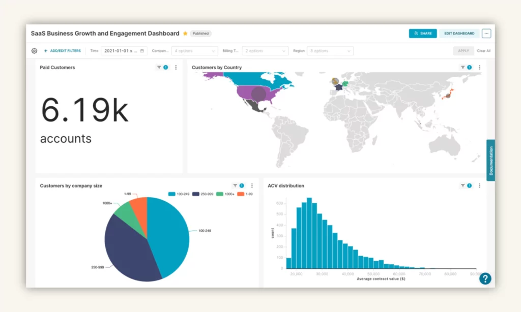
Apache Superset™ is a lightweight, intuitive tool for data exploration and visualization. It’s designed with cloud-native architecture. This means you can run or scale it effectively in cloud environments to meet growing demands without compromising performance.
Features
- Use a no-code interface to build visualizations quickly. You can create robust charts to explore data by simply dragging and dropping elements from Superset’s visualization library.
- Customize charts and dashboards. In case you want to customize visuals to fit your needs, Superset’s plug-in architecture can help. Further, advanced users can employ the SQL Editor to query data directly, tailor SQL queries, and use Jinja Templating to customize visualizations or dashboards.
- Integrate with modern databases. Superset can blend data from different sources without requiring additional ingestion layers. This reduces costs and complexity.
- Offer developer-friendly features. Superset provides an API for developers to meet complex requirements and expand software features. Also, it makes new functionalities accessible through feature flags.
Pricing
Like KNIME, Apache Superset is completely free and open-source. Accordingly, you can download and use this data analytics tool without any licensing fees. Yet, you still need to consider some incurring costs involved in its deployment and maintenance:
- Infrastructure: Examine costs for servers, storage, and networking if you’re self-hosting Superset.
- Cloud Services: Costs arise for deploying Superset on cloud-based systems (e.g., AWS or Azure).
- Tailored Development: You can pay for development costs to customize features or integrations.
- Maintenance: Consider paid support and maintenance services as well.
5. Qlik Sense
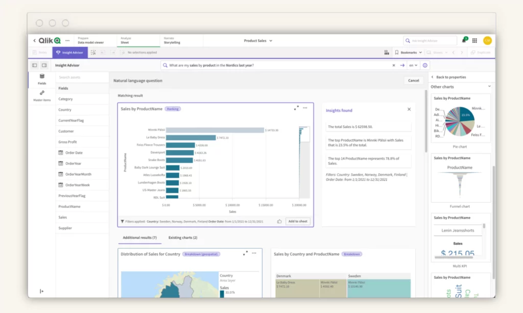
Qlik Sense is a modern analytics platform that empowers users of all skill levels to generate AI-powered insights and take intelligent action. It includes two options: Qlik Cloud® Analytics for cloud-based SaaS deployment and Qlik Sense® – Client Managed for on-premises deployment in highly regulated industries.
Features
- Allow for embedded analytics in popular business apps. You can use JavaScript with strong APIs and libraries to develop and integrate Qlik’s real-time insights and visualizations into your business apps. Even when you have no coding knowledge, you can easily embed analytics through Qlik Sense’s embedding toolkit.
- Augment analytics with AI capabilities. Qlik Sense uses Insight Advisor, an intelligent AI assistant, to enhance data analytics. Particularly, this bot can answer your queries, generate summaries, make predictive insights, and test what-if scenarios.
- Create intelligent visualizations and dashboards. Qlik Sense combines its Associative Engine and AI capabilities to help you create interactive dashboards and explore data further through deep analytics.
- Build custom reports. You can easily pull data from Qlik Sense and tailor reporting templates with precise layouts and professional designs to meet your requirements. Then, you even build automation to distribute reports through alerts.
Pricing
| Package | Pricing |
| Qlik Cloud® Analytics(a cloud-based SaaS solution hosted by Qlik) | – Standard: $825month- Premium: $2,500month- Enterprise: contact sales |
| Qlik Sense® – Client Managed(an on-premises solution hosted by clients) | Contact sales |
6. Grafana
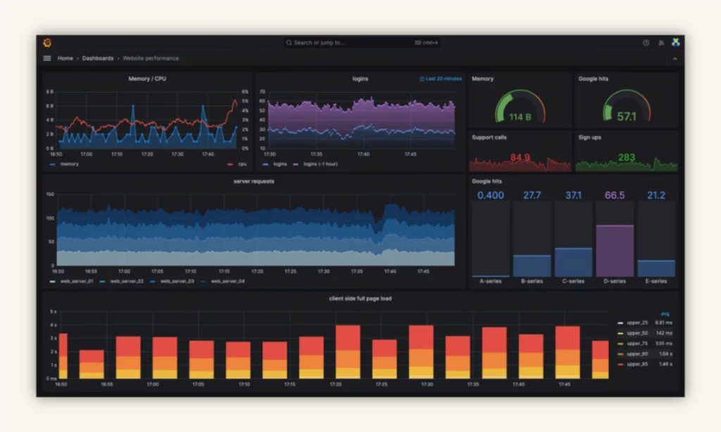
Grafana is an open-source data analytics and data visualization platform. It enables you to query, visualize, and interpret your data from different time series databases like MongoDB, GitLab, or Splunk. The platform is widely used for tracking business metrics, analyzing app performance, managing system health, and visualizing IoT data.
Features
- Employ AI/ML capabilities to automate repetitive data tasks. Grafana uses Adaptive Metrics to determine which metrics are partially used or unused and group them into low cardinality dimensions to reduce metrics costs. It also integrates Sift – an AI assistant – to investigate and spot anomalies within data, hence improving MTTR. Other GenAI features, meanwhile, help with summarizing incident reviews, building PromQL queries, generating content for dashboards, etc.
- Explain root causes with Grafana Cloud Asserts. This tool helps you interpret the behavior of your app or services by quickly spotting anomalies, identifying where they occur, and uncovering their root causes.
- Set up automated alerts with Granafa Alerting. This feature allows you to proactively detect and respond to issues within data, no matter where the data is stored.
- Connect and visualize data from different sources. Grafana offers plugins and extensions to blend and visualize data in a centralized platform.
Pricing
Grafana is completely open-source. So, it has a free version that provides a wide range of features for small-scale or personal use without paying licensing fees. However, you’ll be charged for additional features and commercial licensing in two following cases:
| Package | Pricing |
| Grafana Cloud(Fully managed) | – Free Forever- Pro: at least $19/month- Advanced: at least $299/month |
| Grafana Enterprise Stack(Self-managed) | – Base/Support + 60 users: $40,000/year- Additional Active Users: $300/user |
7. Sisense
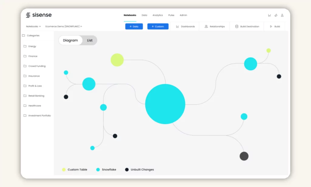
Sisense is a data analysis and business intelligence platform originally developed in 2014. Like other data analytics tools in this list, it integrates AI capabilities to help users access, analyze, and visualize big data in a single, unified place.
Features
- Integrate dashboards and insights into your apps. Sisense offers the Compose SDK toolkit to embed analytics and customize visualizations directly from your apps (e.g., Google Workspace or Slack). With such tools as iFrames or Embed SDK, you can adapt analytics to your design requirements and meet specific needs with no, or minimal, coding knowledge.
- Seamlessly connect data. Sisense allows you to blend data from different sources in three ways. First, it has 400+ connectors to ensure real-time connections and updates for dashboards. Second, you can use ElastiCube, a high-performance analytical database, to import and connect data for quick analysis. Finally, Sisense enables the Hybrid approach, which combines ElastiCube and live connections.
- Facilitate data analytics with AI capabilities. Sisense’s intuitive interface helps you create robust, effective data pipelines securely. Meanwhile, its AI-powered tools help with data preparation, data view customization, and advanced analytics.
- Use generative AI to uncover deeper insights. You can leverage flexible React components and APIs to create LLM-powered analytics chatbots for your needs. Otherwise, you may use Sisense’s chatbot to explore data further and get easy-to-understand explanations for charts.
Pricing
Contact sales!
8. Amazon QuickSight
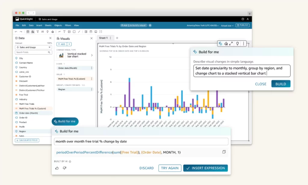
Amazon QuickSight is a cloud-based business intelligence tool that delivers actionable insights to people of all skill levels. It comes with enterprise-grade security practices and user-management features for effective scaling without complex infrastructure.
Features
- Boost business productivity with Amazon Q. Amazon Q is an AI assistant integrated into QuickSight. With Generative BI capabilities, it automatically builds dashboards, tailors data stories, answers questions, performs complex scenario analytics, and more.
- Build and share pixel-perfect reports. You can customize, schedule, and report company-critical insights in a single, unified BI platform.
- Embed analytics into apps. You can integrate interactive visualizations, dashboards, and natural language query (NLQ) capabilities into your apps without extra coding or licensing.
- Empower data insight automation with machine learning. The QuickSight Enterprise edition uses ML capabilities to automate reliable predictions, spot outliers, uncover hidden trends, and translate data into easy-to-understand narratives.
Pricing
Amazon QuickSight is priced by user role (authors or readers) and capacity.
| Package | Pricing |
| Authors(for those connecting to data, generating dashboards, and sharing content with others) | – Author: $24/user/month- Author Pro: $50/user/month |
| Readers(for those accessing interactive dashboards, receiving email reports, and downloading data) | – Reader: $3/user/month- Reader Pro: $20/user/month |
| Capacity(for those buying a large number of Readers sessions and Amazon Q questions) | – Reader Capacity: from $250 for 500 sessions/month- Amazon Q Questions: from $250 for 500 questions/month |
9. Altar RapidMiner
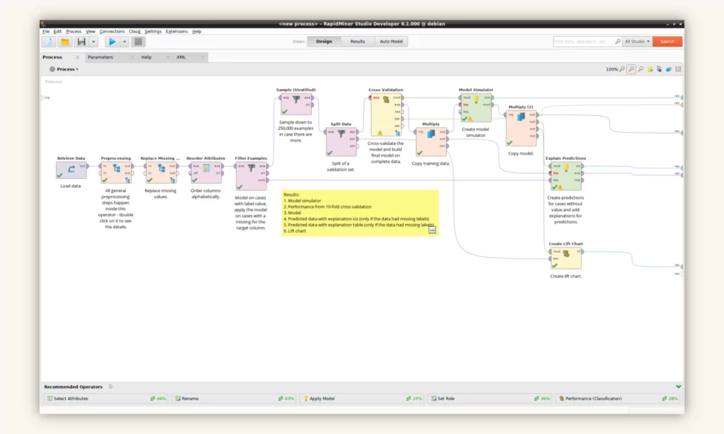
Altair RapidMiner is a scalable, secure data analytics tool powered by AI to derive meaningful insights from data. It provides a user-friendly interface and powerful features for data prep, analysis, and visualization.
Features
- Create company-level knowledge graphs with Altair® Graph Studio™. This tool helps collect data and uncover hidden patterns or relationships within data through AI-powered graphs.
- Use automated functionality to develop AI models. Altair RapidMiner employs features like autoML or auto-feature engineering to build the best model for your use case (e.g., predictions).
- Automate data prep and cleaning. The platform automatically prepares, cleans, and handles your data, albeit structured or unstructured, in seconds.
- Streamline visualization and analytics. Altair RapidMiner helps analyze real-time data to identify trends, outliers, and trends. It also allows you to share findings across the company using interactive dashboards for timely decision-making.
Pricing
Contact sales!
10. Databricks
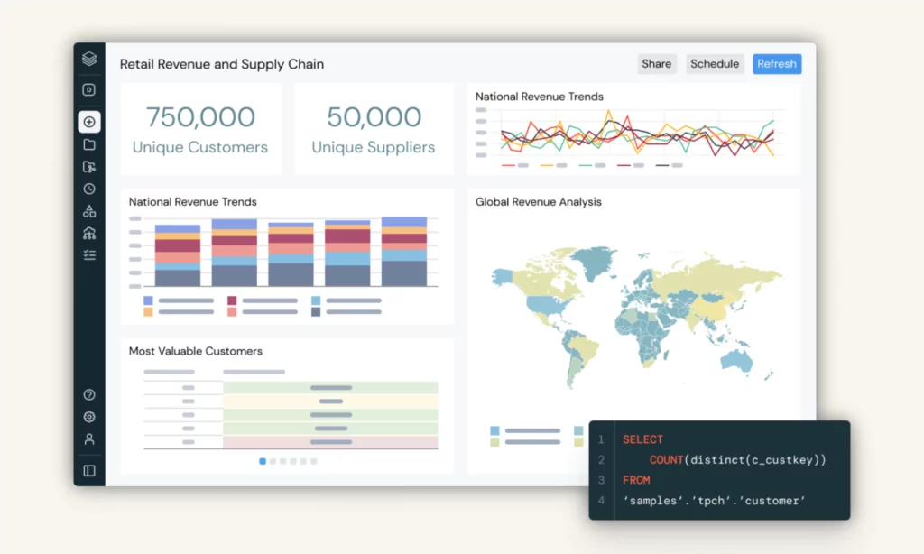
Databricks is a unified tool that helps your company implement data analytics and build AI models at scale. The platform uses lakehouse architecture, which stores and handles structured and unstructured data in a centralized place to easily derive meaningful insights. Moreover, it employs machine learning capabilities for faster, yet effective data analytics.
Features
- Process and analyze vast datasets in real-time. Databricks offers data streaming solutions like Delta Live Tables (DLT) and Spark Structured Streaming to handle high data volumes and automate operational tasks like dependency mapping in real-time.
- Perform SQL analytics with Databricks SQL. This intelligent data warehouse offers a user-friendly interface to query, visualize, and analyze data at scale. It also allows you to build or tailor visualizations based on query results, share dashboards, and set up real-time alerts to stakeholders.
- Advance analytics with AI/BI. Databricks combines AI and BI capabilities to make analytics and insights accessible to everyone. Typically, it provides a low-code interface to configure data and build interactive dashboards using natural language queries. It also integrates an AI-powered Genie to explain the “why” behind insights.
- Govern data with Unity Catalog. Unity Catalog enables you to smoothly manage structured and unstructured data regardless of its format, as well as ML models, files, or dashboards. This helps people within your team securely access, discover, and collaborate on data across platforms.
Pricing
Databricks now comes with two pricing options: Pay As You Go (only pay for what you use without upfront costs) and Committed Use Contracts. The total Databricks costs depend on various factors like the cloud provider you choose, Databricks editions, or Databricks unit (a measuring unit for compute usage). Use this pricing calculator to estimate your Databricks cost.
How to Choose the Best Data Analytics Techniques and Tools
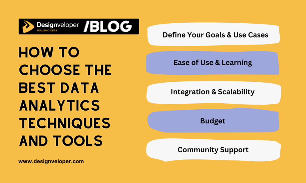
Choosing the right data analytics techniques and tools is essential to ensure your seamless and effective analysis tasks. Below are five key considerations to guide your tool decision:
1. Define Your Goals and Use Cases
Start by understanding what you want to achieve eventually. Are you working on data cleaning, visualization, or predictive analytics? This question helps you choose tools and techniques that meet your specific demands. For example, Google Sheets and Microsoft Excel are sufficient if you only focus on basic data analysis. Meanwhile, Amazon QuickSight and Sisense are more helpful for business intelligence.
2. Ease of Use and Learning
Next, consider whether those tools and techniques align with your current skill level and provide opportunities to grow. Opt for beginner-friendly tools like Microsoft Excel or Tableau if you just start visualizing data.
3. Integration and Scalability
The tools and techniques you choose need to incorporate smoothly with your company’s existing infrastructure and workflows. Further, when your business or data demands evolve, these tools must scale along to process larger datasets in the future.
4. Budget
Consider your company’s budget by assessing the cost of the tools versus their potential value. While open-source tools like Apache Superset are cost-effective, you should try freemium versions of paid tools.
5. Community Support and Resources
Finally, prioritize tools and techniques that have active communities and rich learning resources like online courses or documentation. These sources help with troubleshooting issues quickly and upskilling your people.
Conclusion
Data analytics techniques and tools play a crucial role in unlocking hidden insights for intelligent decision-making. Therefore, choosing the right ones helps you maximize the value of your data and achieve your business goals. If you want to know more about data analytics, subscribe to our blog and receive the latest updates!


Related Articles
Read more topics


